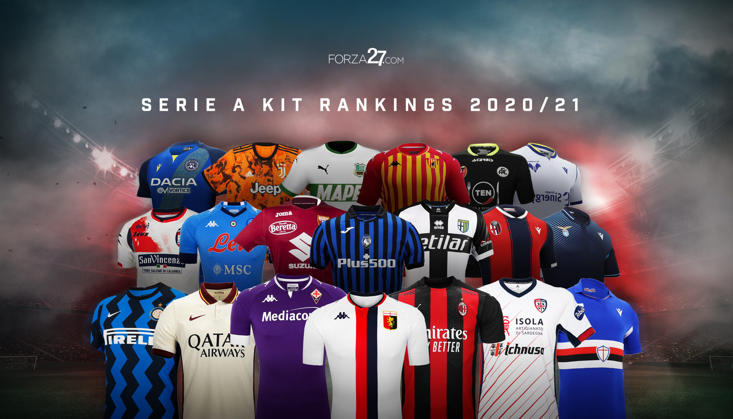
Forza27’s Serie A Kit Review returns with a full review and rankings of all 2020-21 kits.
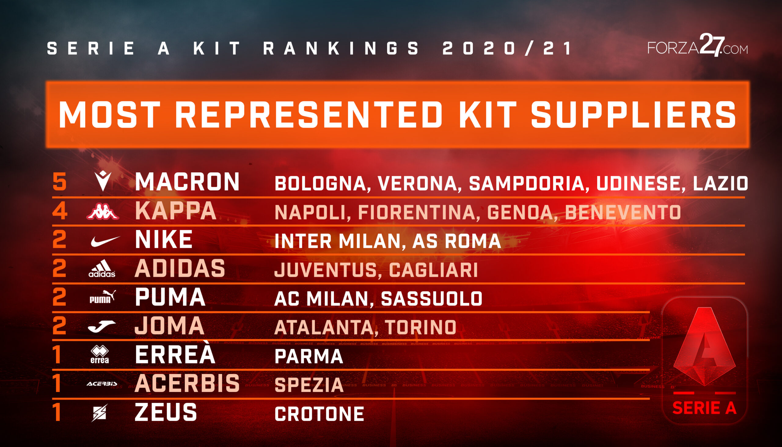
This is the third incarnation of Forza27.com’s Serie A Kit Rankings (see previous versions here: 2019; 2018), slightly later than usual this year, but isn’t everything in 2020? The competition for places has never been as fierce. This season we have seen a big shift in terms quality and originality in the design from all clubs in Serie A, so big credit must go to all the kit manufacturers. From the big brands like Nike and Adidas, to the local suppliers like Macron and Kappa, to the lessor known names like Zeus and Acerbis, we haven’t seen Serie A kits look this good since the glory days of the 90s.
The rankings, which originally appeared on twitter here, are based on a combination of all three of the home, away and 3rd kits for each club. This means a classic home kit could be pegged back a few slots by a poor away or lazy 3rd. Overall, we have seen a big improvement in terms of design in the kits, all of which makes for a great battle for the top spot. Indeed, the top 7 or 8 kits below could’ve easily been in a different order, such was the competition. There are some surprises at the top, and this year we have a new champion.
Scroll down to view in more detail (and click on each image to see bigger), and if you’d like to share your thoughts or tell us your top kits for this season get in touch here.
![]()
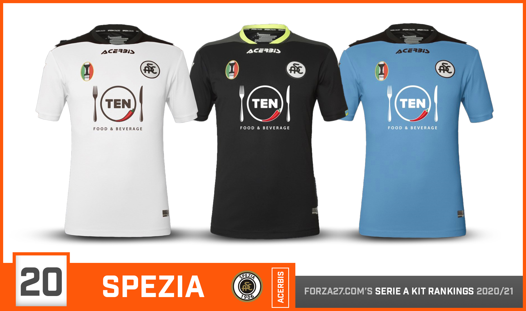
[20] Spezia (new entry)
Spezia are in Serie A for the first time in their history. Designed by Acerbis, the home, away & 3rd kits all use the same template. A special crest on the left marks their victory in the 1944 Campionato Alto Italia victory (a one off competition).
![]()
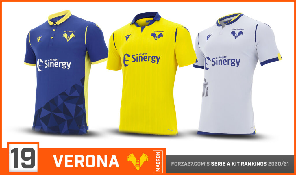
[19] Verona (down 4)
Verona’s recent rebranding saw a slick new logo introduced. The blue home kit features a geometric triangle pattern which ends rather abruptly in the middle of the shirt. The yellow away has very fine vertical stripes, with a reversed white 3rd.
![]()
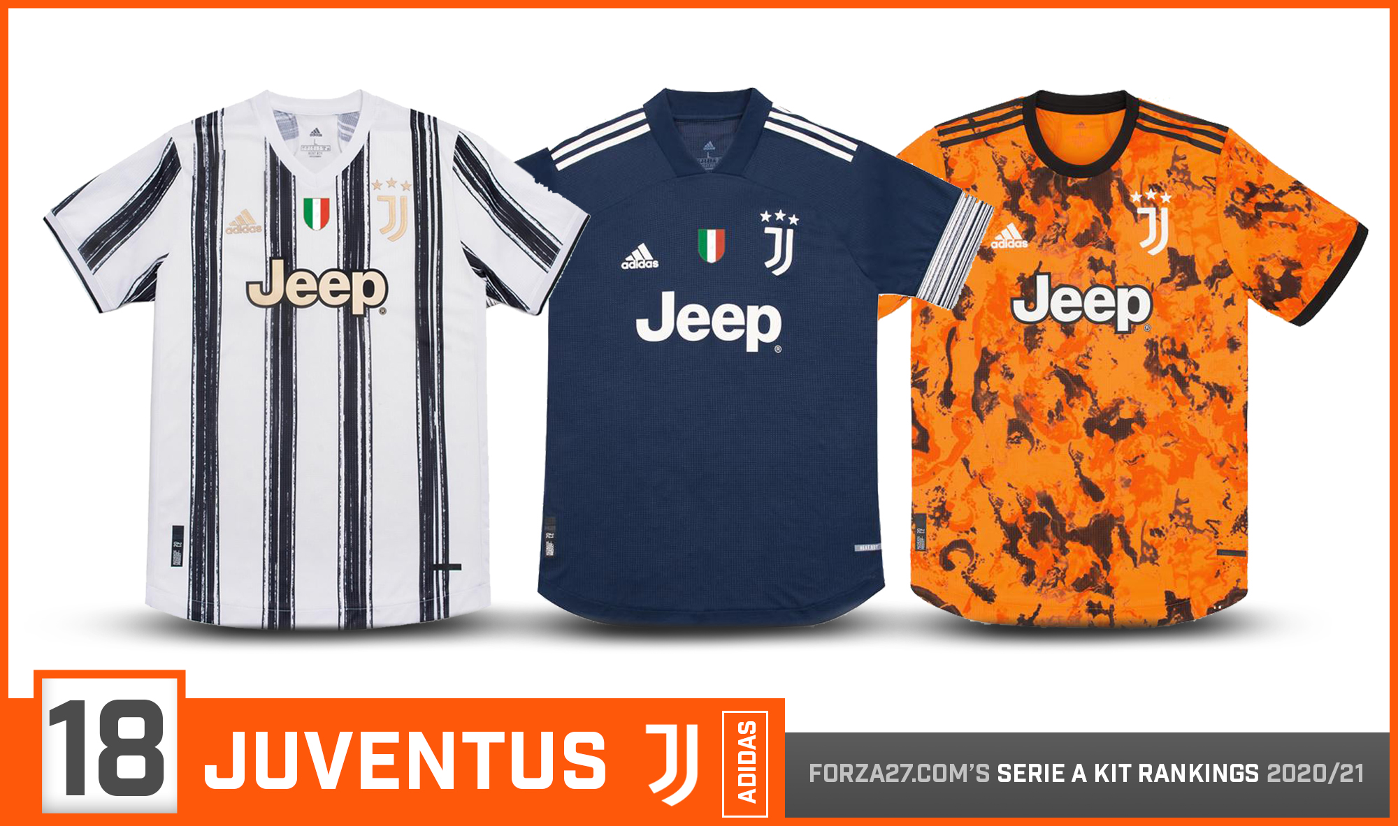
[18] Juventus (down 10)
Adidas are looking to make a big statement with Juventus’ kits. Last seasons controversial kits angered a lot of fans for ditching the stripes but made big impressions design wise. Reverting back to the black/white stripes for 2020/21, if not quite as everyone remembers them. A smartly designed navy away is the best, while an art-inspired orange/black patterned 3rd fails to impress.
![]()
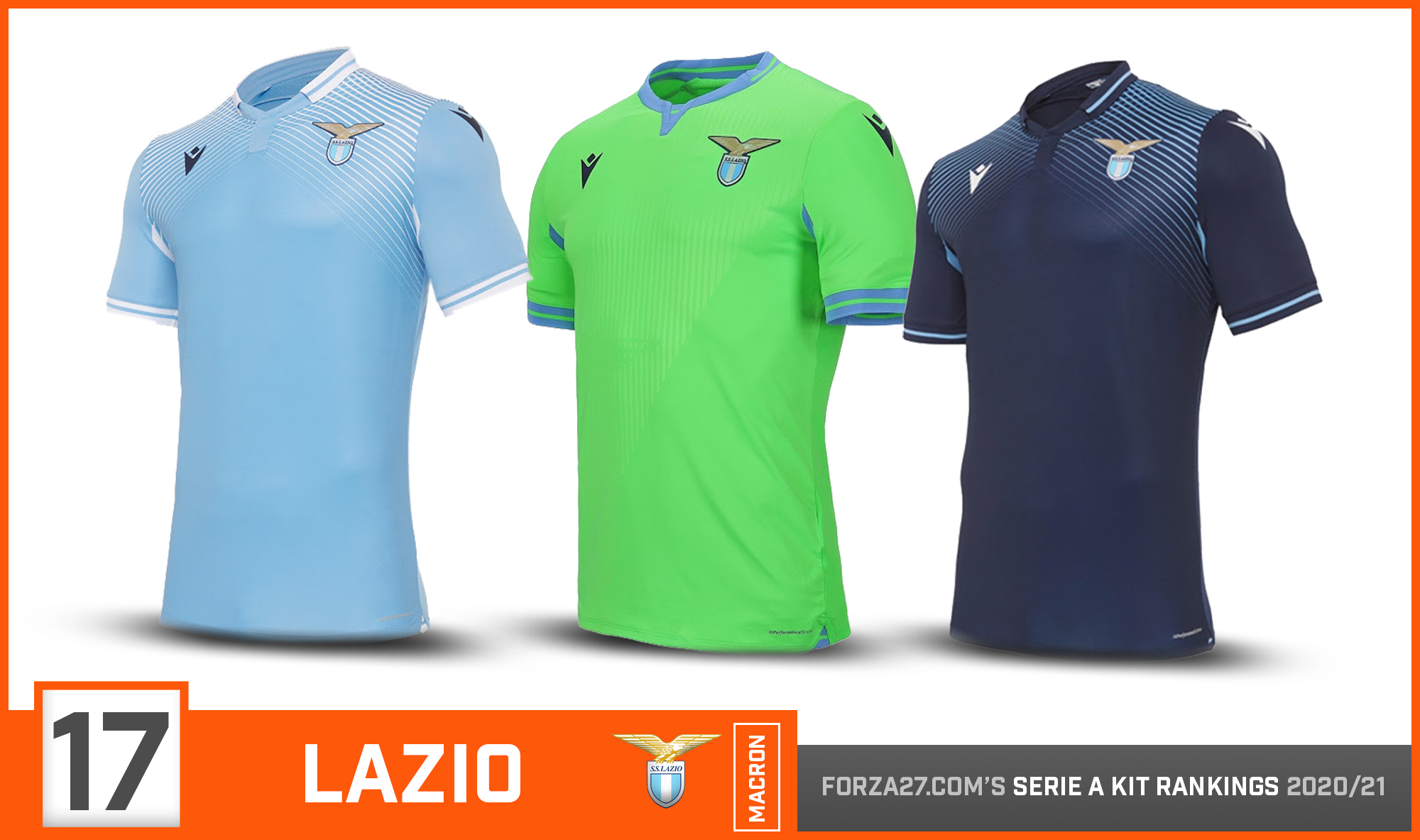
[17] Lazio (down 7)
A big backward step from Lazio, as Macron introduce a rather dated looking angled striped pattern on a plain sky blue home & a matching navy 3rd. A striking fluorescent green mixed with the sky blue on the away kit leaves a lasting impression in all the wrong ways.
![]()
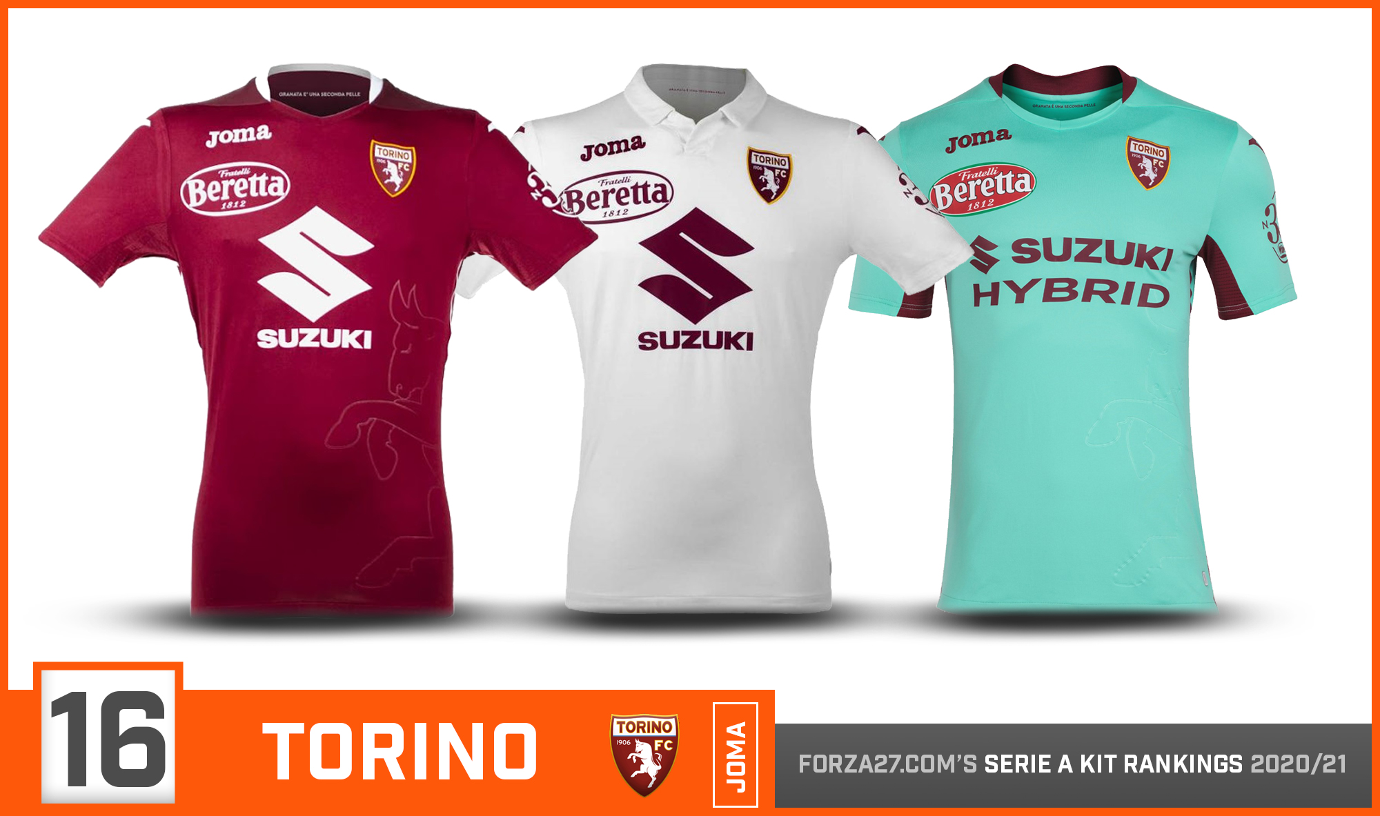
[16] Torino (up 4)
An improvement for la Granata, who finished bottom of the pile last season. A more modern look on the home which has an embossed Toro graphic, while the white away really comes into its own with a stylish, clean look. A notable turquoise 3rd completes the set.
![]()
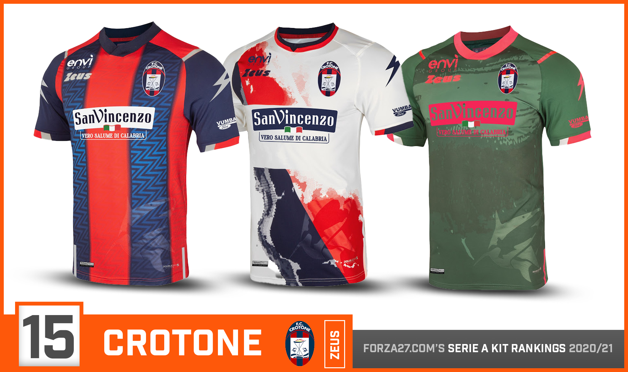
[15] Crotone (new entry)
Serie A new boys Crotone certainly aim to make a big impression. Credit to Zeus for some creative & original designs, with notable elements ranging from sharks, maps, torches, flags and even the Temple of Hera Lacinia. Yep. Whats not to like!
![]()
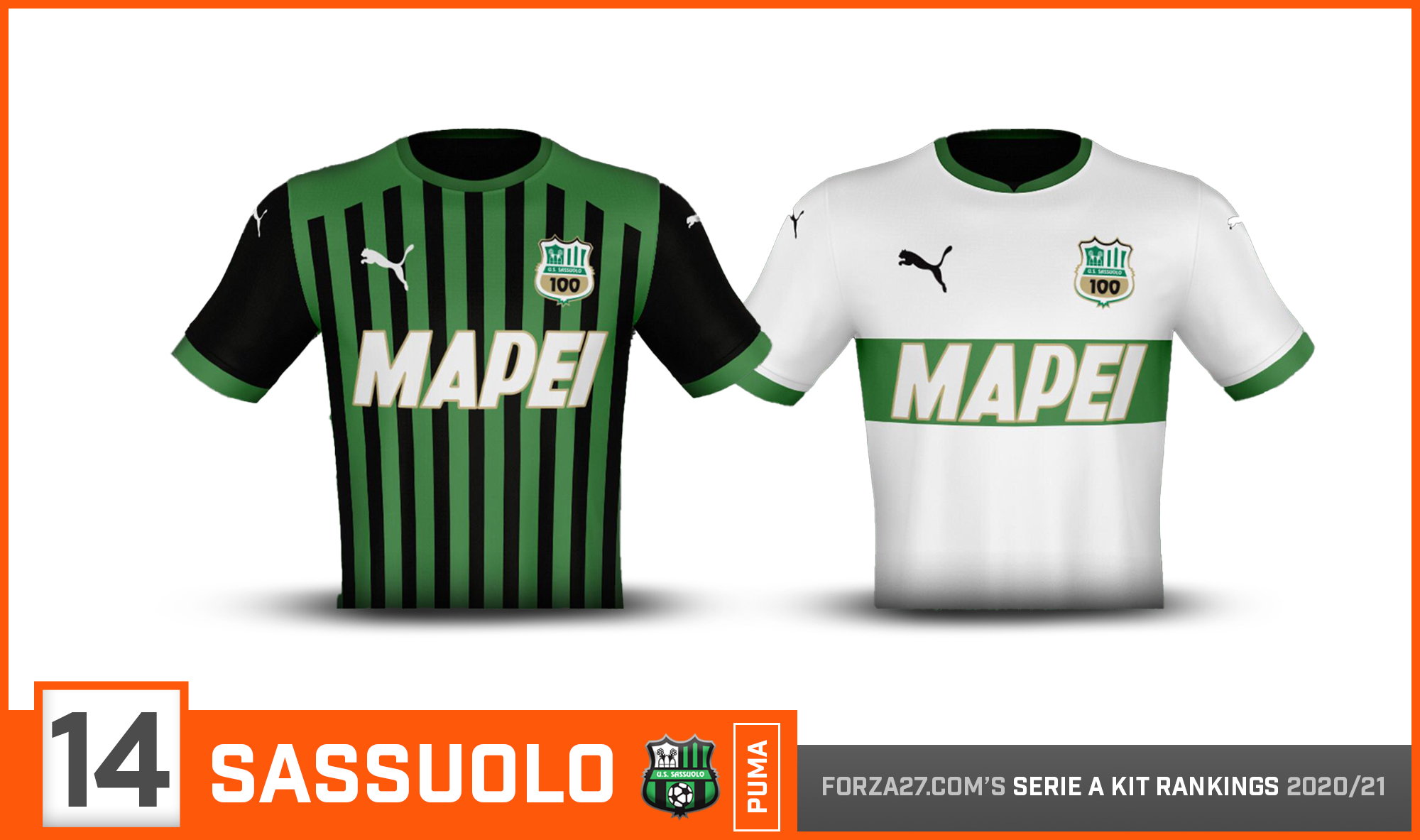
[14] Sassuolo (same)
Sassuolo make the move to Puma, but still can’t help but feel that green/black home should be stronger. Like last season, the white away makes up for it. Both will use the Centenary edition of the club logo, marking 100 years since Sassuolo’s foundation. 3rd still not released.
![]()
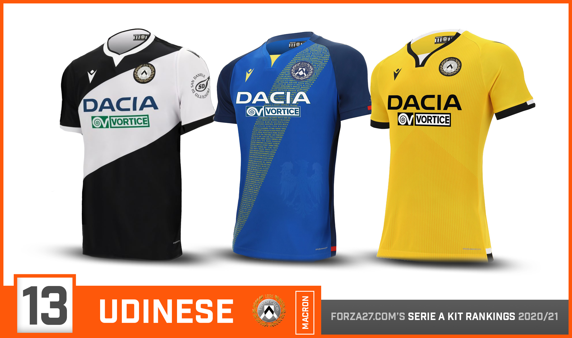
[13] Udinese (down 4)
Udinese swap the traditional vertical stripes for a diagonal white on black look, inspired by their kits from the mid 80s made famous by Zico. A Friuli-inspired blue away has names from around the world forming the diagonal band, with a plain 3rd yellow.
![]()
[12] Napoli (up 6)
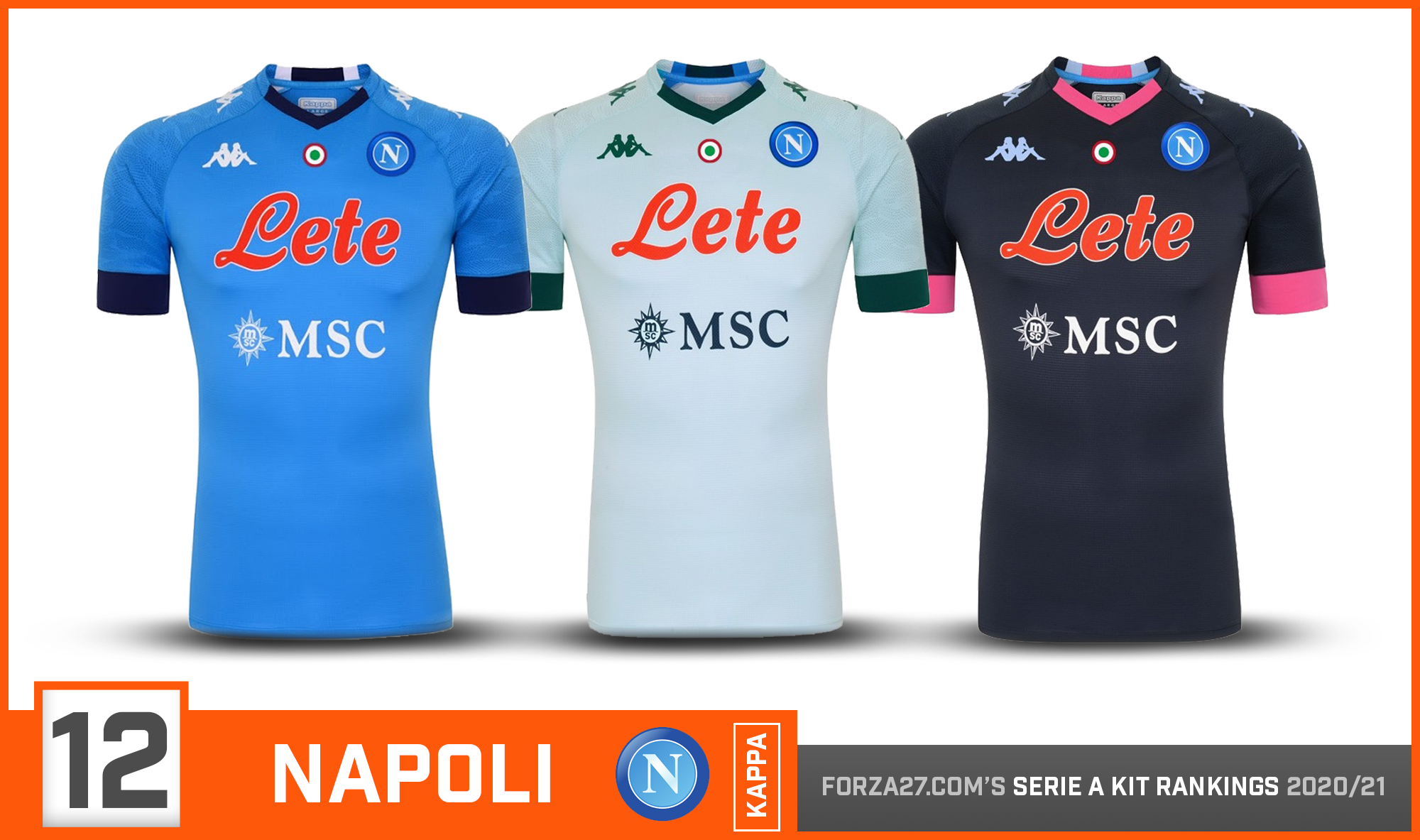
Napoli have become synonymous with Kappa’s tight Kombat pro templates, replicated here across all 3 kits, but the biggest talking point is the Lete sponsor losing the red box following a new Serie A ruling. The ‘Lete’ still appears in red, however, causing a big contrast on the azzurri on the home.
![]()
[11] Cagliari (up 2)
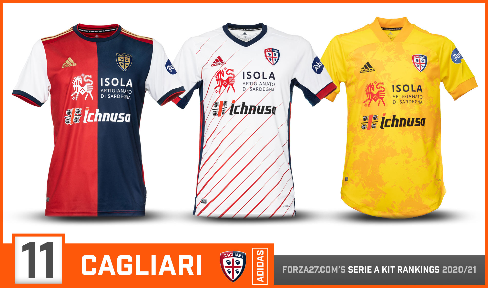
A big move for ambitious Cagliari who team up with Adidas. The home is a mixed bag, with the gold Adidas stripes & monochrome logos & controversial white sleeves. A stylish white away has thin, angled lines, and a new 3rd yellow. You can’t mention Cagliari kits without mentioning those sponsors, which as always give them a unique look.
![]()
[10] Benevento (new entry)
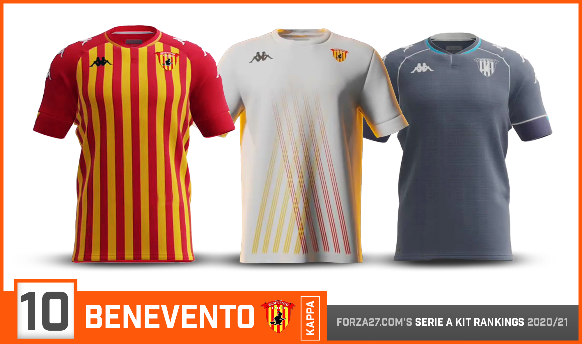
A strong line-up from Benevento & Kappa. The clubs traditional yellow/red vertical stripes has a thinner, more traditional look, with strong red sleeves showing the Kappa logo. A striking unique white away in inspired by the Witches of Benevento, with a blue 3rd.
![]()
[9] Bologna (down 2)
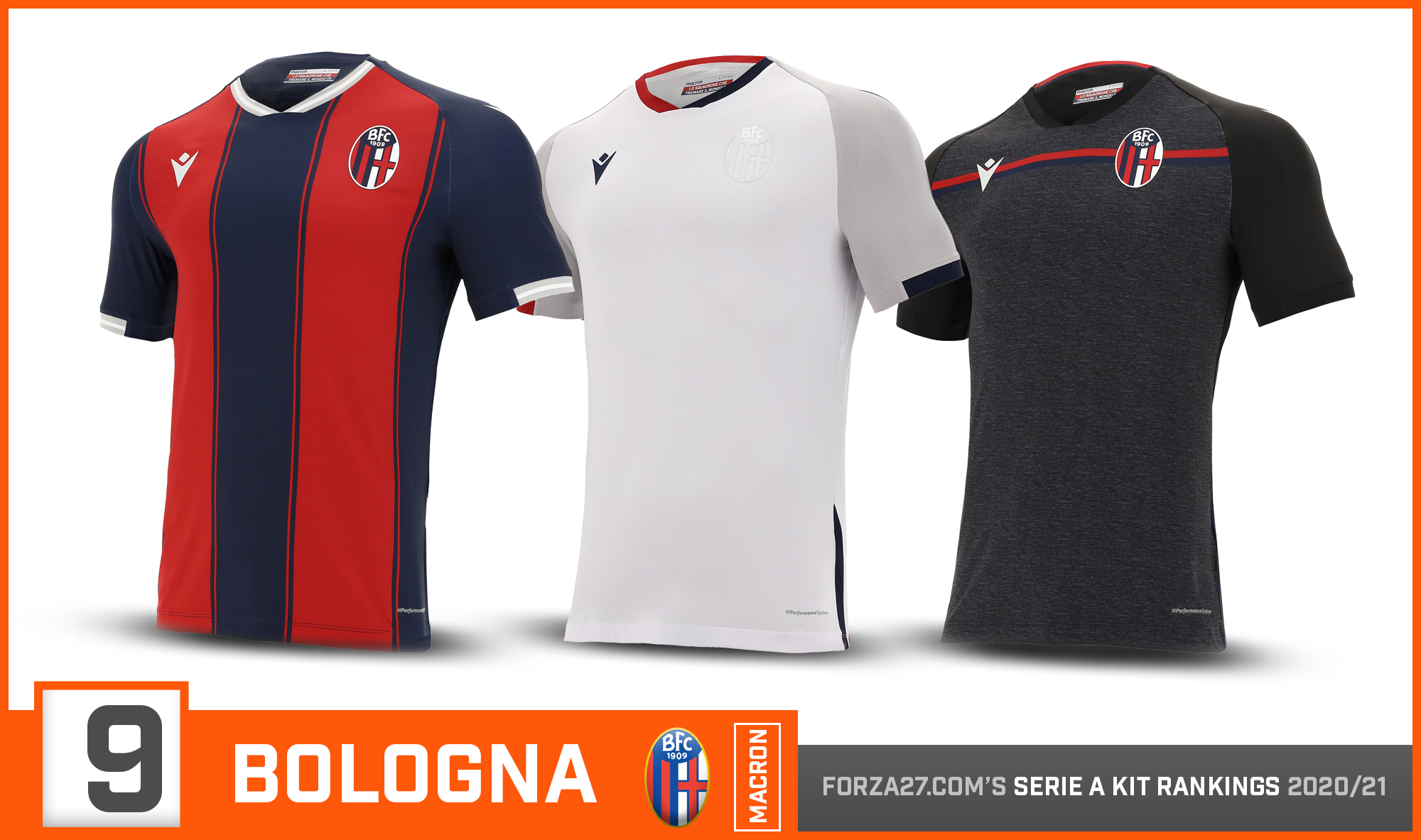
A traditional red & blue vertical striped home which never fails. The white & grey combo away is simple & clean, with Macron going for a more fashionable approach. The 3rd gives off strong training kit vibes.
![]()
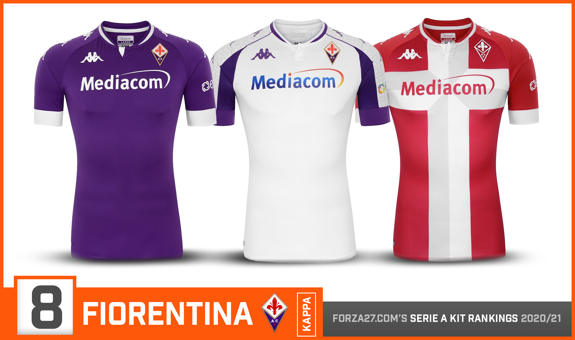
[8] Fiorentina (up 8)
There was much anticipation after Fiorentina moved to Kappa from Le Coq Sportif. The similar home & away are stylish if unspectacular, with Kappa’s Omini logo running down the sleeves. A striking red 3rd with the flag of the Florentine Republic down the middle is the best of bunch.
![]()
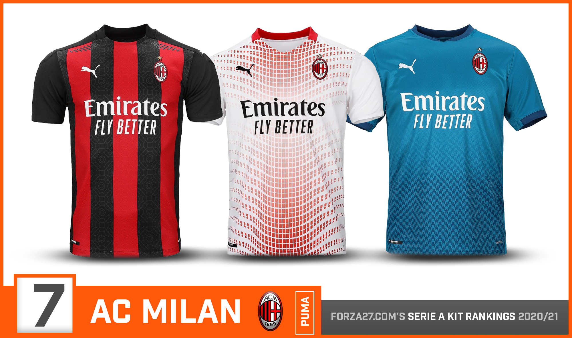
[7] Milan (up 4)
Puma continue to impress, & get more adventurous with Milan compared to previous seasons. Intricate patterns inspired by the famous Galleria Vittorio Emanuele II appear on the classy home shirt. The pattern on the white away falls down a bit, while a teal 3rd is inspired from the mid to late 90s versions.
![]()
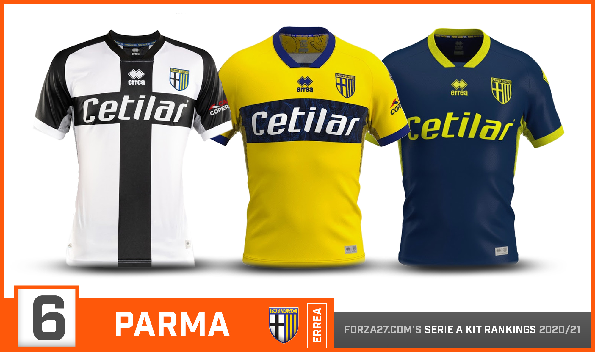
[6] Parma (down 5)
A big drop for the back-to-back champions of the last two Forza27 Kit Rankings. Thats not to say Errea have slipped, but perhaps the competition has finally caught up. A similar home to last season, and basic if yet stylish as ever away & esports-inspired 3rd.
![]()
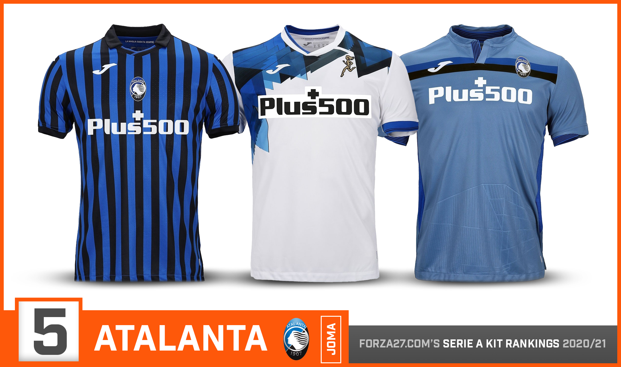
[5] Atalanta (down 3)
A return to thinner stripes marks a big improvement for Atalanta’s home by Joma, which has a more traditional, classic look. Another unique design on the away, if not as nice as last seasons. The 3rd features an embossed print of the Gewiss Stadium.
![]()
[4] Inter (down 1)
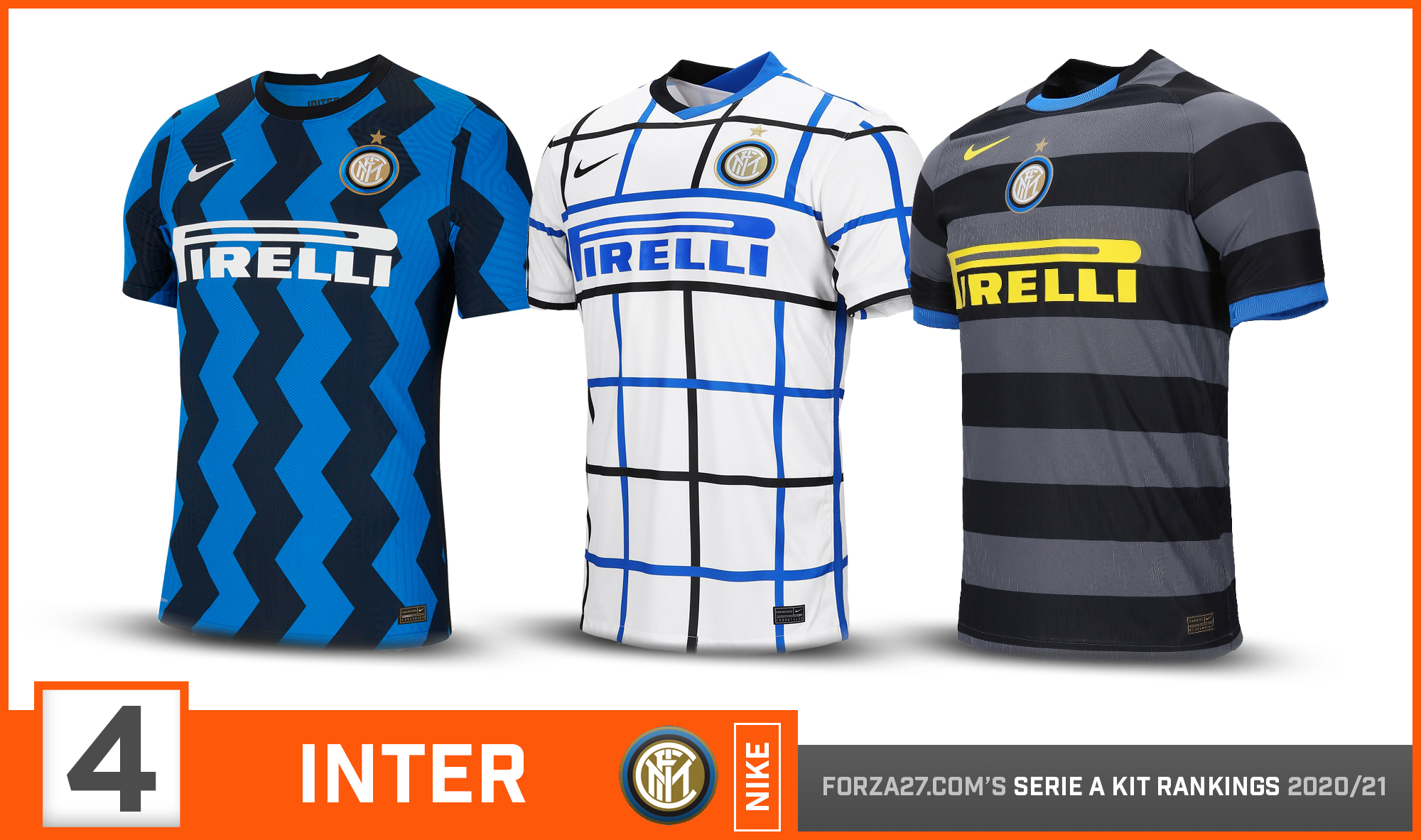
Pop style, zigzag waves, or il Biscione. Whatever you prefer to call it, Inter’s zigzag home has certainly made an impression. The ‘tablecloth’ away is one that grows on you, but it’s nice to see more creativity from Nike. The 3rd follows Nike retro range, replicating that classic dark 97/98 kit.
![]()
[3] Sampdoria (up 2)
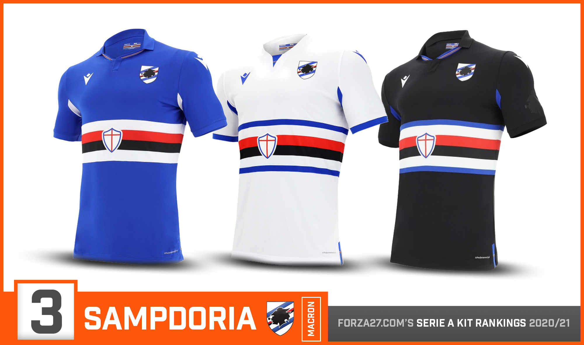
A new home for la Maglia piú bella del mondo with Macron, & they haven’t disappointed. The same template for all three kits – with the iconic colour bands placed a little lower – but perhaps no more is needed. The Macron logos on the sleeves is also a nice touch.
![]()
[2] Genoa (up 2)
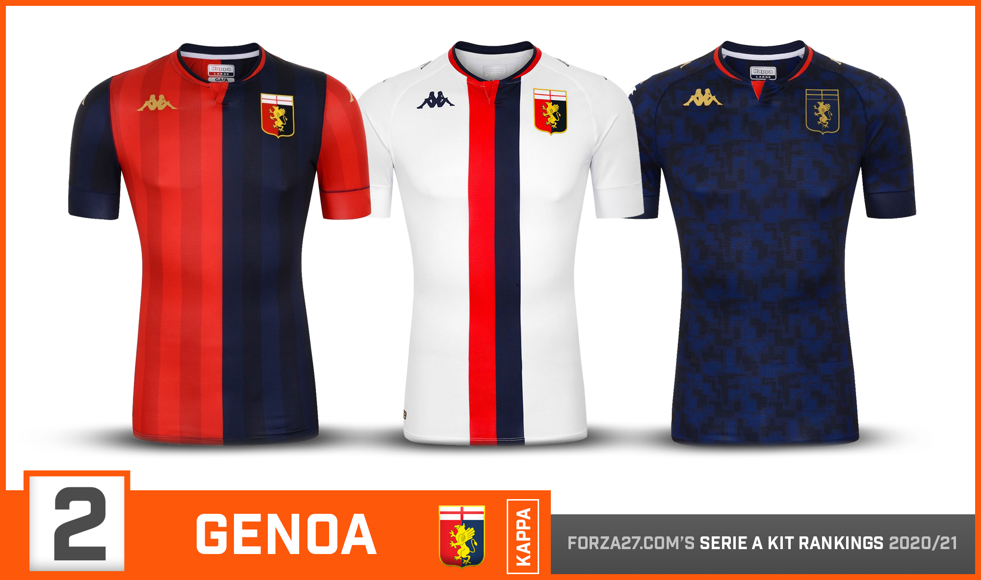
Consistently brilliant from Kappa, this is probably as strong a trio you could get. Almost. The classic half & half home is matched up cleverly with a double striped away, which has Kappa’s trademark Omini down the sleeves. A stylish dark 3rd completes the set.
![]()
[1] AS Roma (up 5)
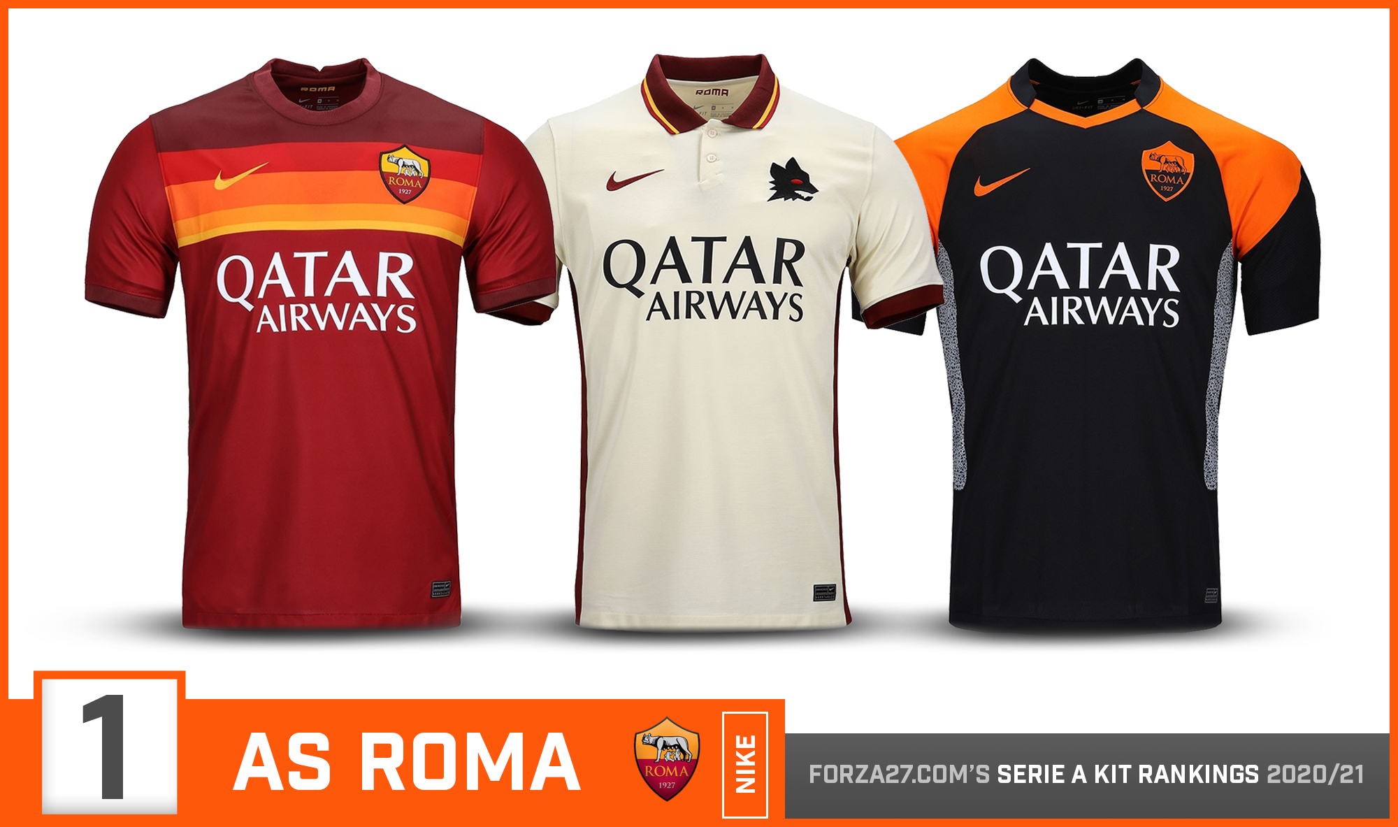
Full circle for Nike, ironically on AS Roma’s last year with them. The home is inspired by Roma’s iconic ‘lollipop’ kit. The away kit is the real star of the show, a beautiful light pale-ivory base which sees the return of the lupetto, & kit of the season. A black/orange combo 3rd completes the set, and makes AS Roma our winner for 2020/21.


