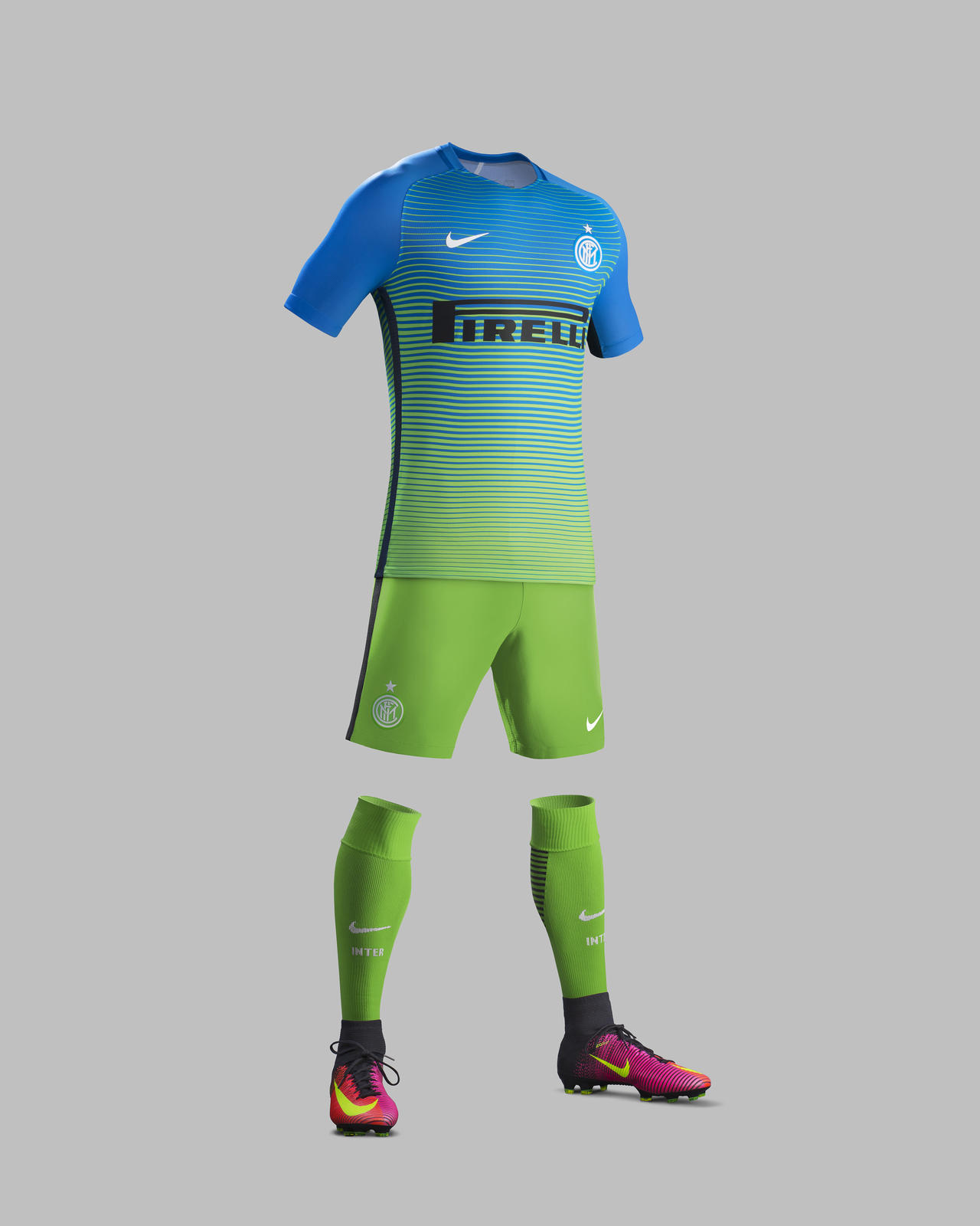
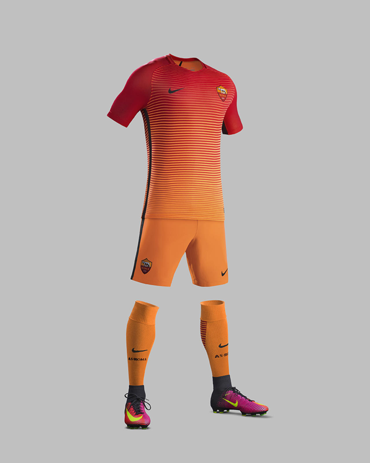
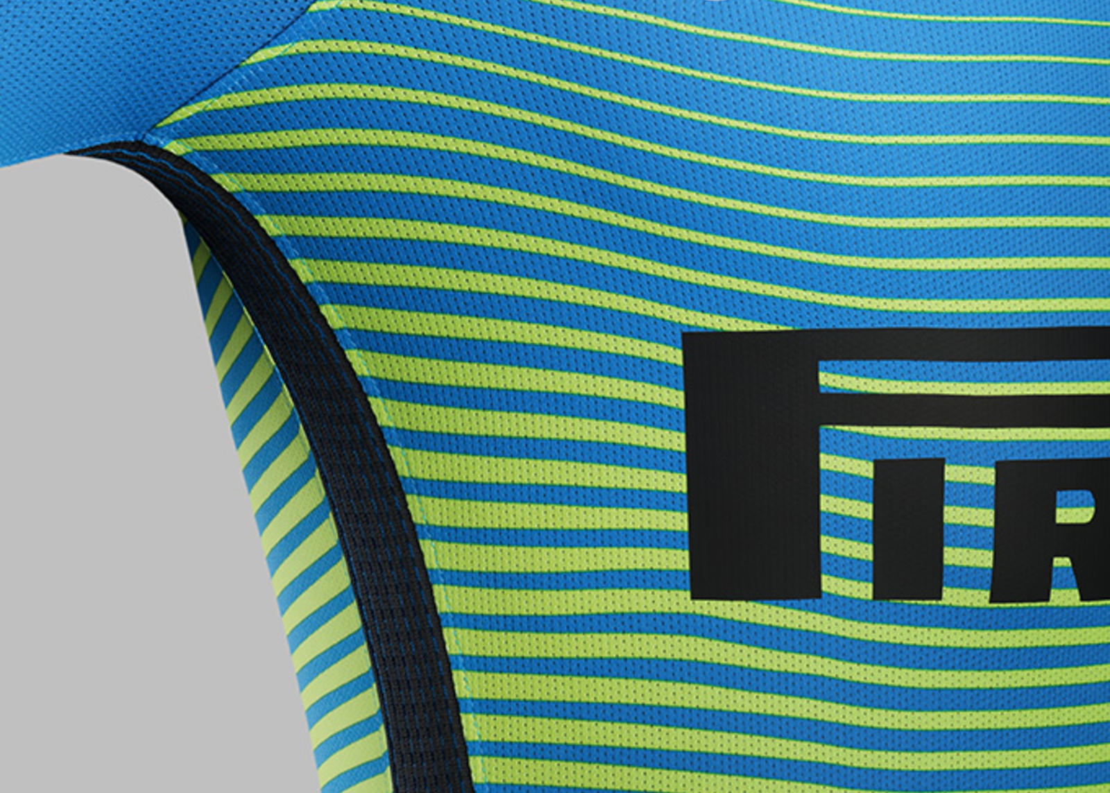
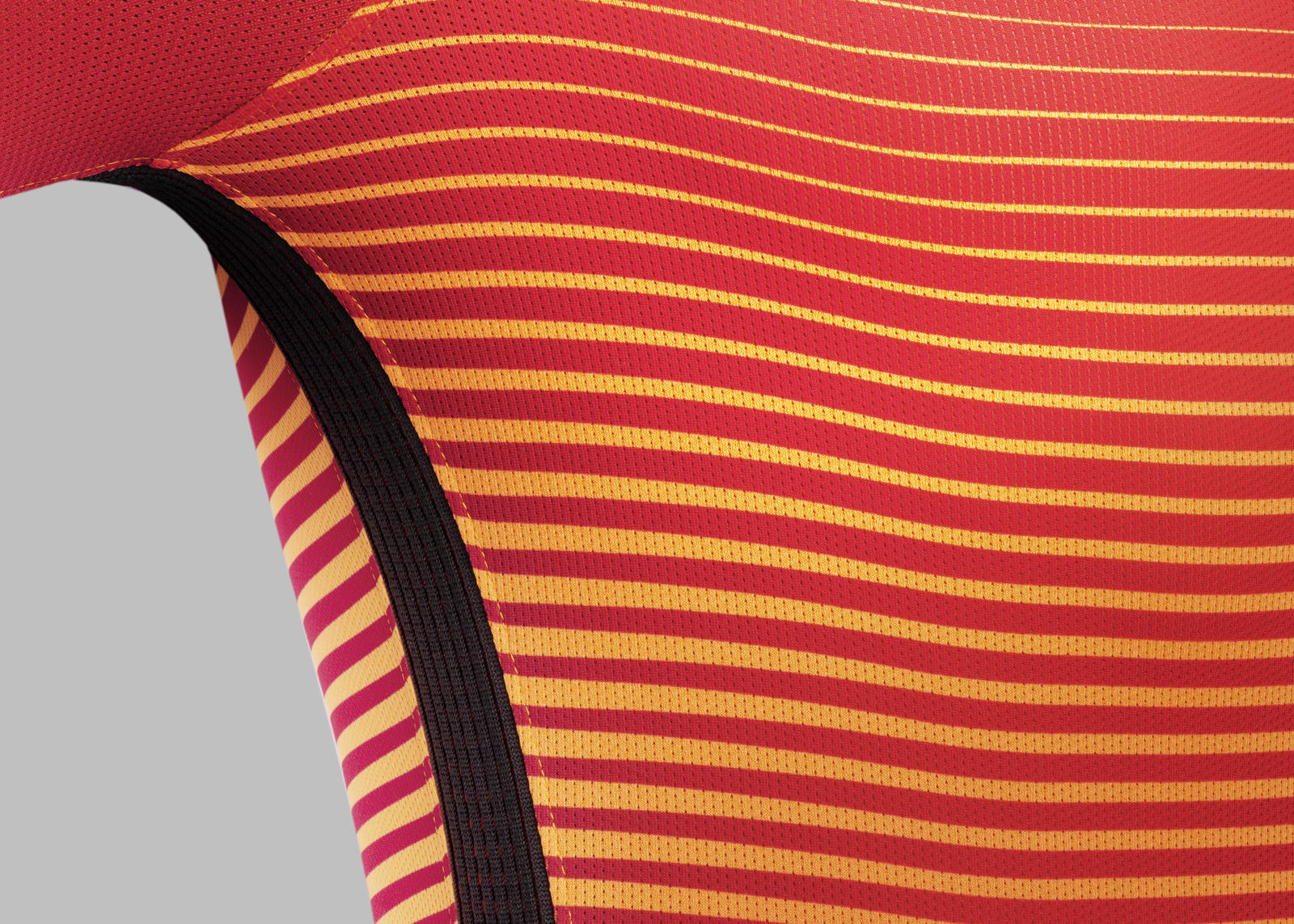
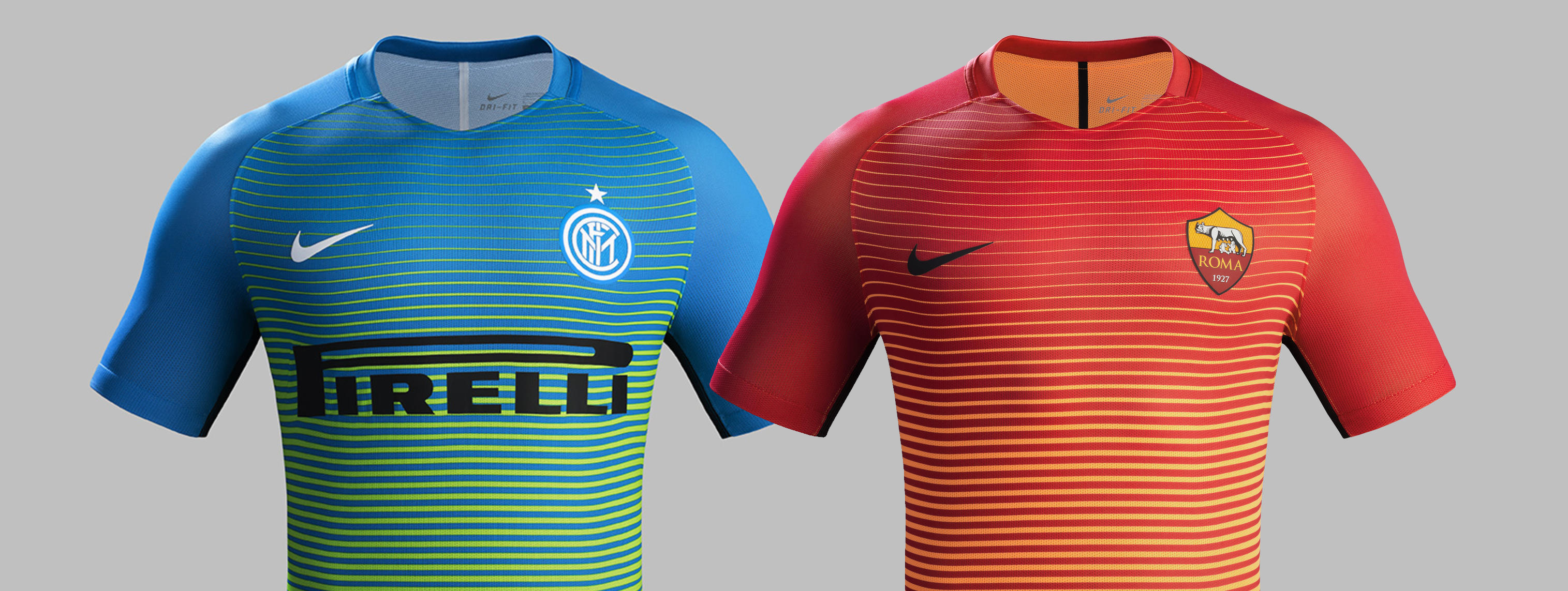
 Today Nike unveiled new 3rd kits for Serie A heavyweights Internazionale and AS Roma. Based on Nike’s new global 3rd kit template, the kits introduce a vibrant gradient design with a horizontal stripe pattern that fades towards the hem.
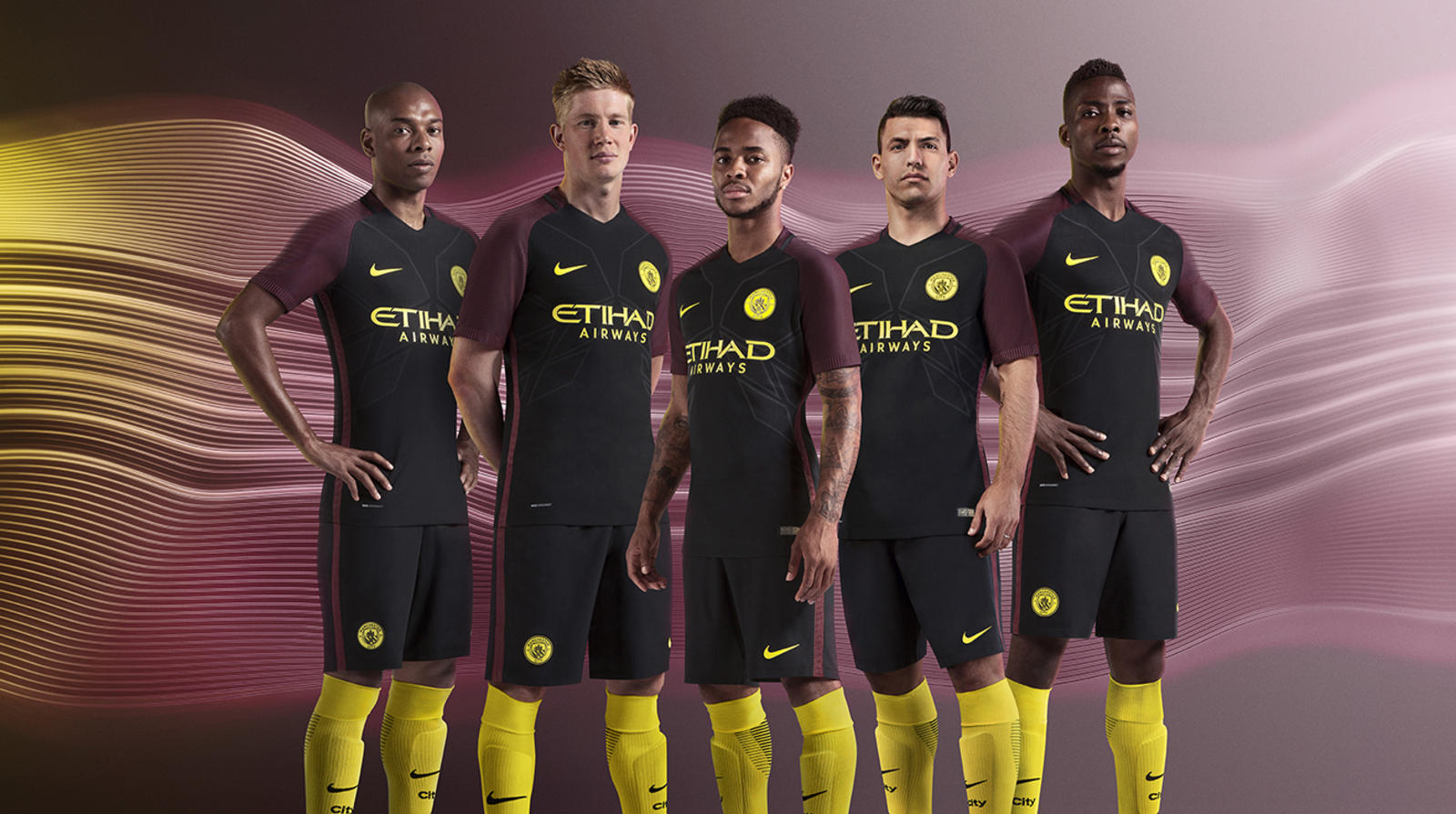
The new global 3rd kit template, which will also produce kits for Barcelona, Manchester City and Galatasaray, to name but a few, is virtually identical in material design except for the obvious colour gradient difference in each. Last year we seen a similar pattern from Nike with their Night Rising range.
The 3rd kits for Barcelona and Manchester City are set to be released this week with the return of the Champions League, but popular football site FootyHeadlines.com revealed the images last week.
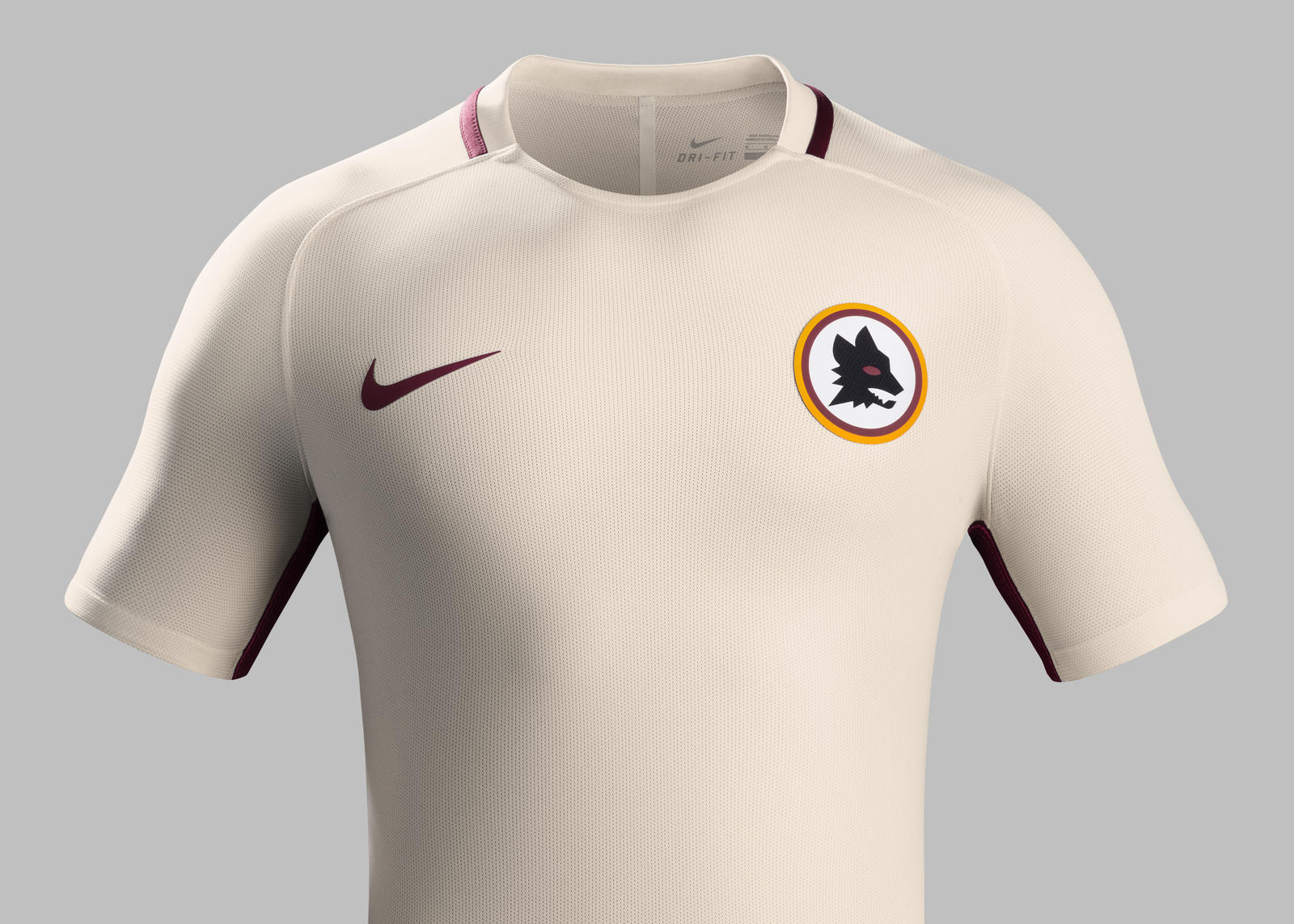
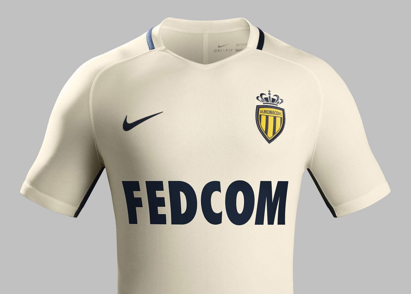
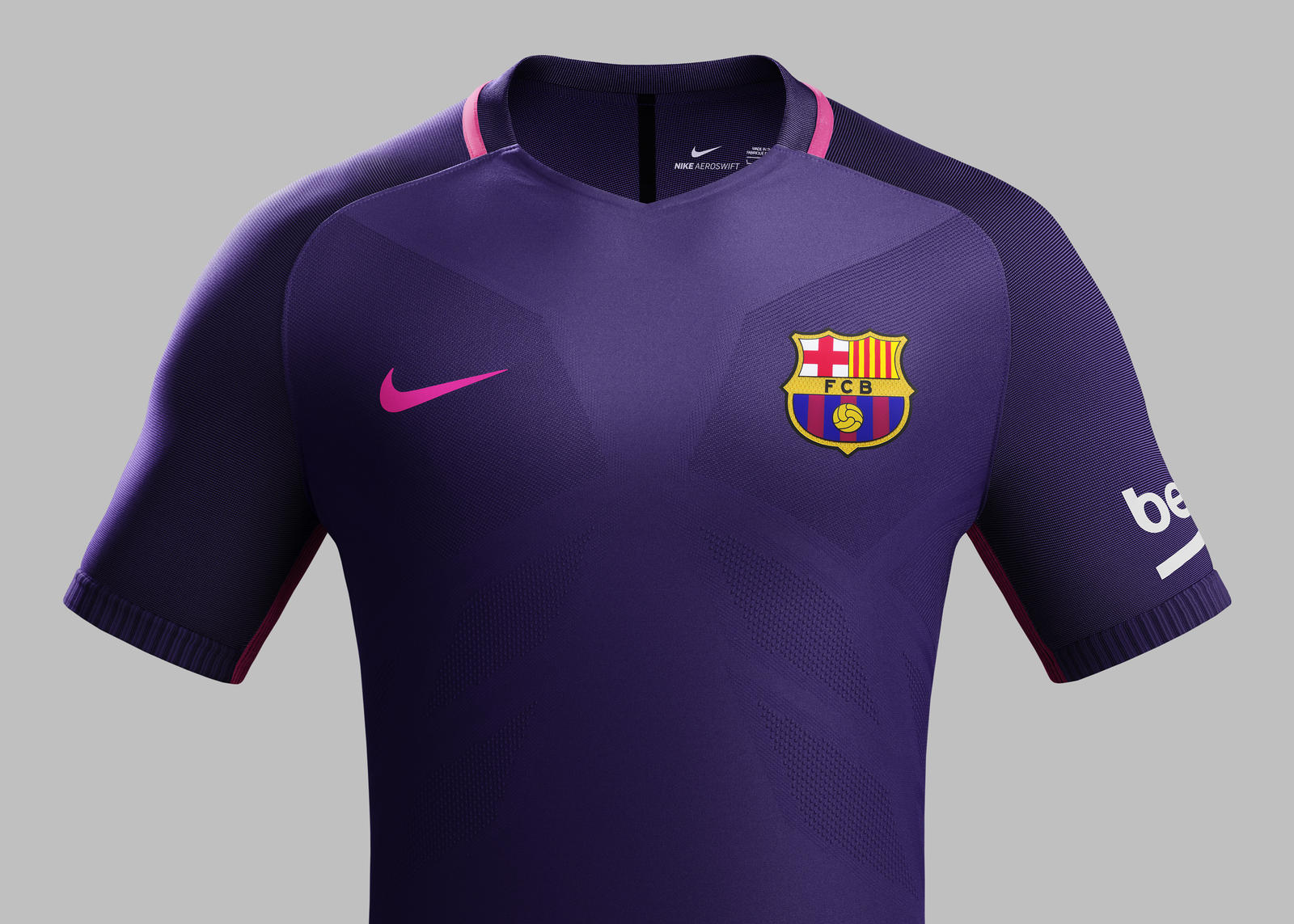
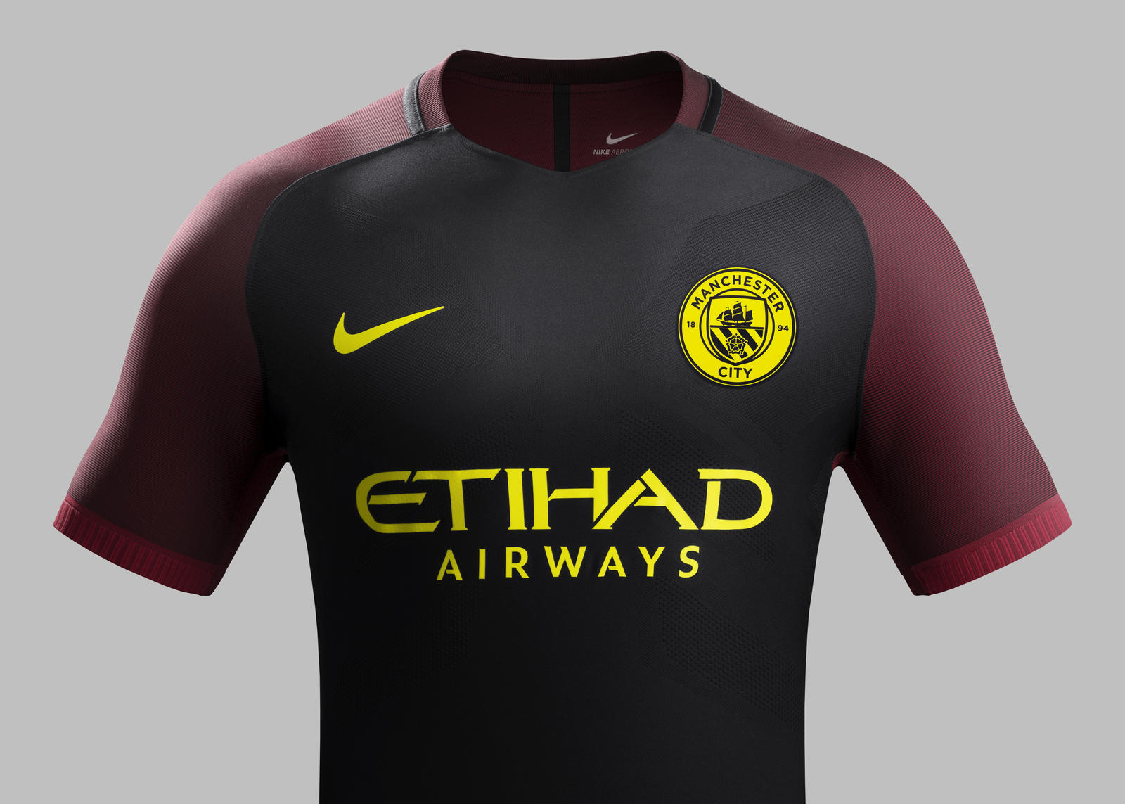
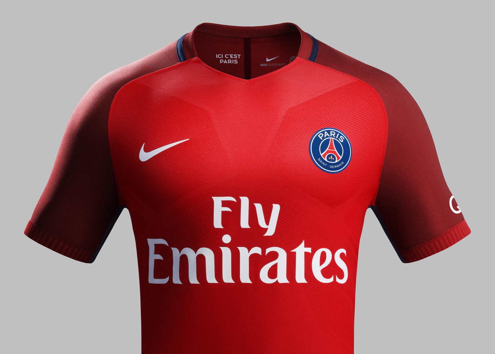
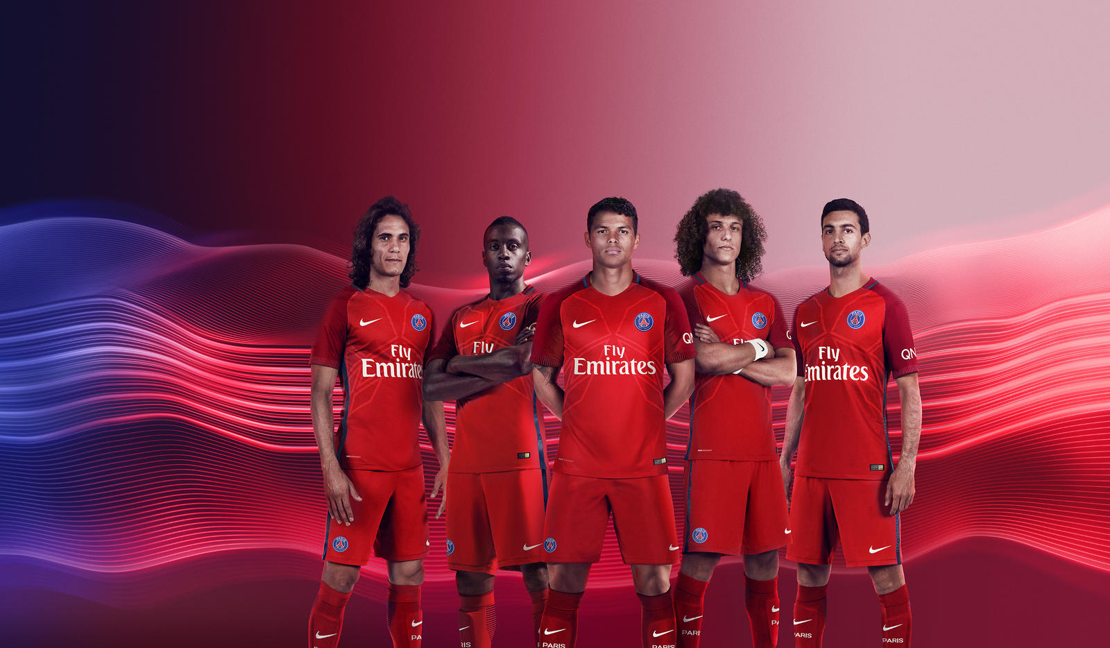
Nike has come in for criticism in using templates for their kit designs which is apparent in many 1st, 2nd and 3rd kits of various European clubs. Below you can see some of these kit templates used for different clubs, and the question which needs to be asked is why?
The 2nd, away kits for AS Roma and AS Monaco – same template (click to see bigger)
Is this a branding and marketing decision, consciously making these kits and templates all the same to be easily identifiable as Nike? Or is it simply a case of being lazy and using the same template knowing that each club will be content with what they produce as the big money deal has already been secured? It points toward the former, surely, which only raises further questions of how much input clubs have at all in the design of their own kits.
Other kit manufacturers like Puma, Kappa and Le Coq Sportif have, at least, produced some exciting, fresh designs this season.
Away kits for Barcelona, Man City, PSG and even international sides like Holland: you guessed it – all the same template
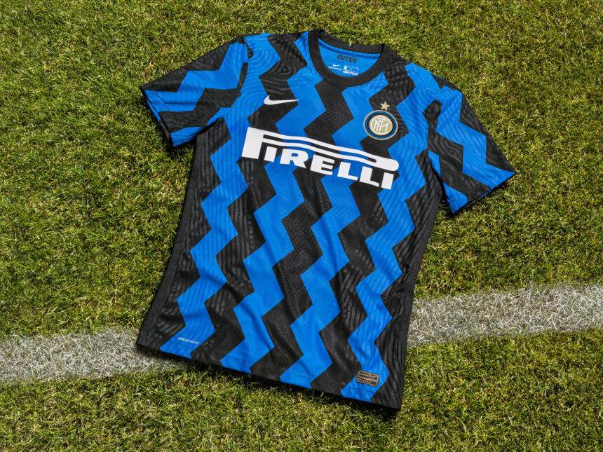
I’m not suggesting that these kits are in anyway ugly or unattractive – Inter’s home shirt for this season is stunning – but how much is enough in terms of similarity? Will all future kits be the exact same and uniform, determined by the brand, only to be differentiated through colour and crests?
Or, if we’re lucky, how about some creativity and design innovation for each club which brings individual meaning and connection that the fans can relate to? Time shall tell, but for now: Go Team Brand.
All images via News.Nike.com

