Forza27’s Serie A Kit Review returns with a full review and rankings of 2019/20 kits released so far.
After the great response of last years rankings (see: Serie A 2018/19 Kit Review) there was much anticipation and excitement for all the new club kits ahead of the new season. The rankings below (this year appearing in numerical order) are based on all two or three kits combined which have been released thus far for each club, meaning a classic home kit could be pegged back a few slots by a poor away or lazy 3rd. Likewise, a lot of clubs have yet to unveil their 3rd, as is the norm with the bigger manufacturers, which would’ve also had an effect on the rankings.
Scroll down to view in more detail, and view the original rankings on twitter here, and if you’d like to share your thoughts or tell us your top kits for this season get in touch here.
![]()
[20] Torino (down 10)
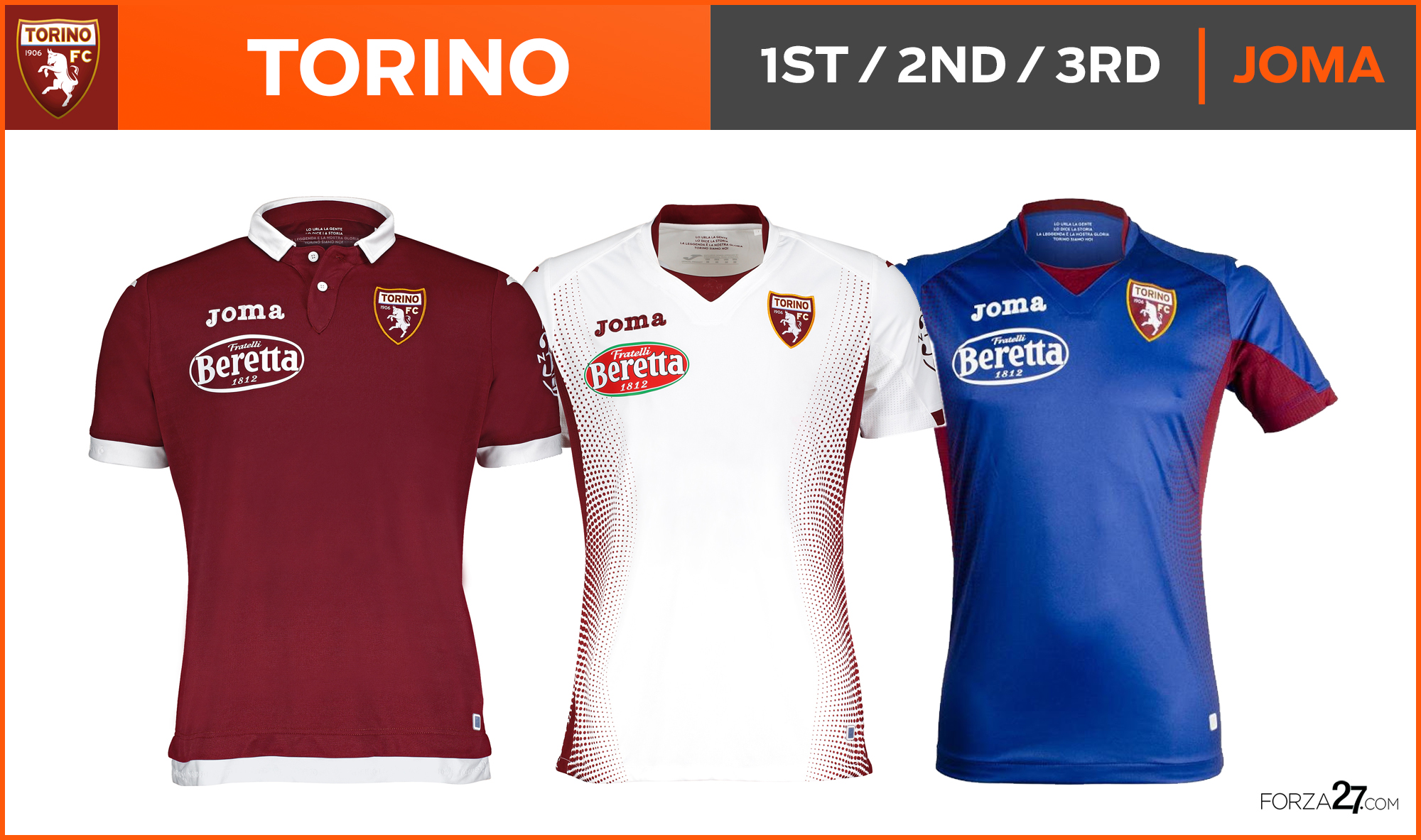
A first year for Joma with Torino and its a real mixed bag. A traditional look for the home has a classy collar & cuffs which ultimately flatters to deceive. An intriguing dotted gradient detail appears down the sides on the away and is continued on an ugly colour combo reverse 3rd.
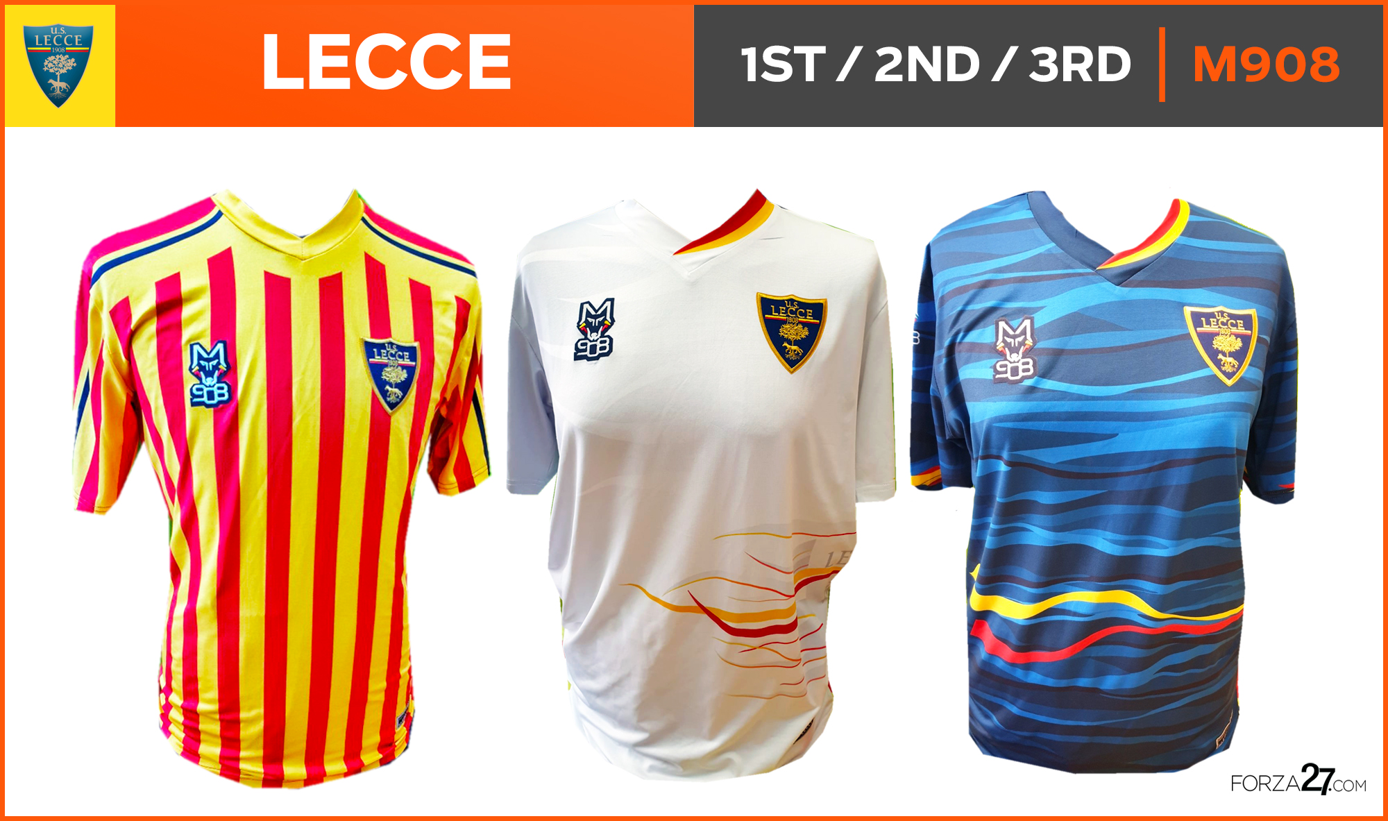
[19] Lecce (new entry)
I’ve always been a fan of Lecce’s kits throughout the years (the colours) but these, produced in-house by M908 (which explains the poor quality release pics) feel a tad over-designed. The traditional home with stripes is the standout.
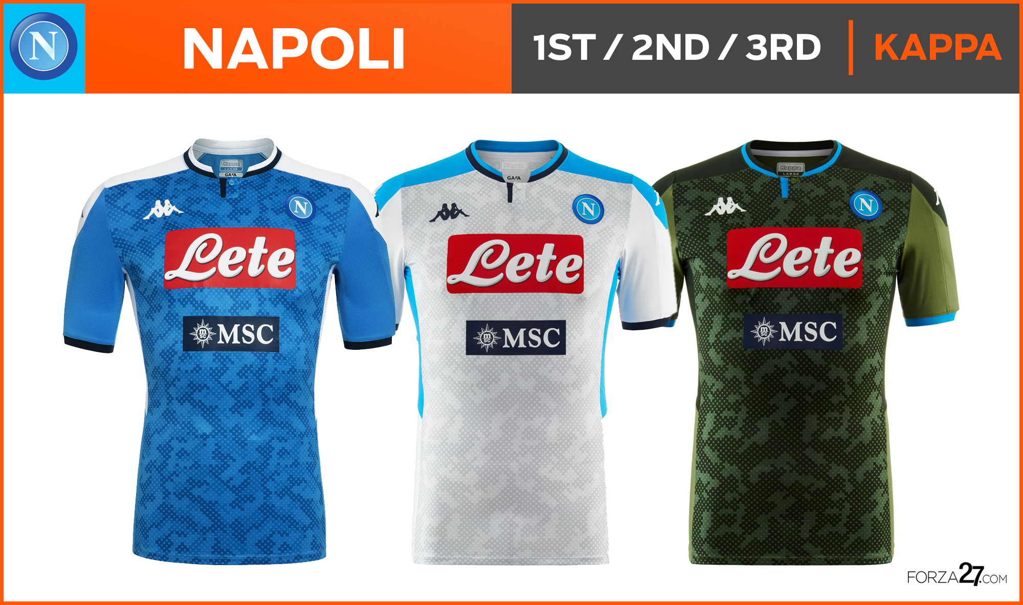
[18] Napoli (down 11)
I admire the originality Kappa go for with these Kombat templates (see more here), and by itself the camouflage print is interesting, but when all put together there is just too much confusion to contend with. The reverse white away is the best, & army green 3rd has a nice base but clashes with the logos.
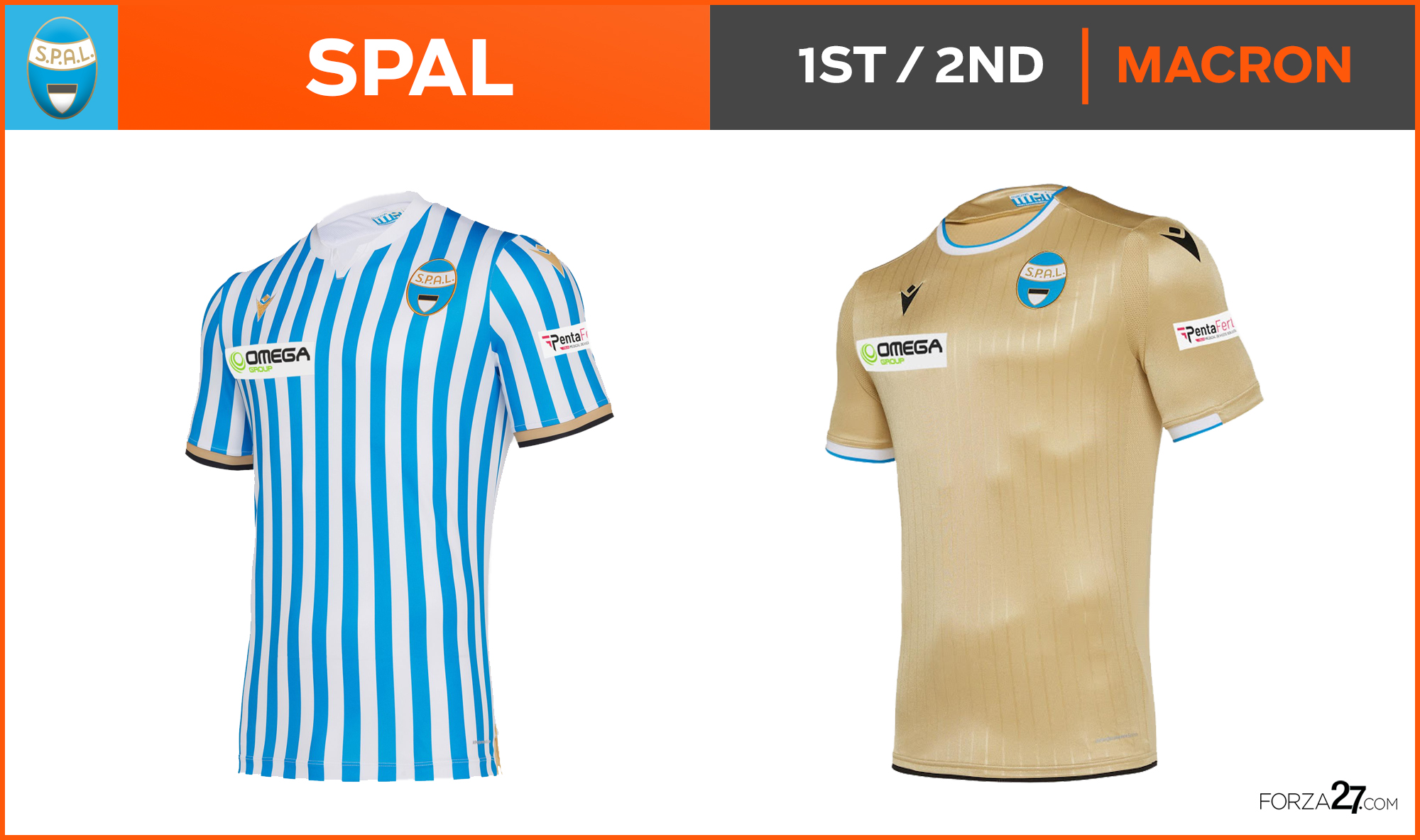
[17] SPAL (up 1)
The traditional thin vertical stripes on SPAL’s home kit never let you down and have a classy finish, but they can begin to feel a bit dated. Gold trimmings appear which leads to the grandiose all-gold away, with the sponsor logo small on the right.
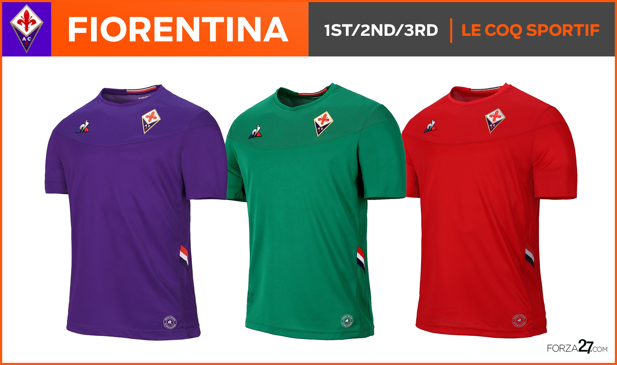
[16] Fiorentina (down 8)
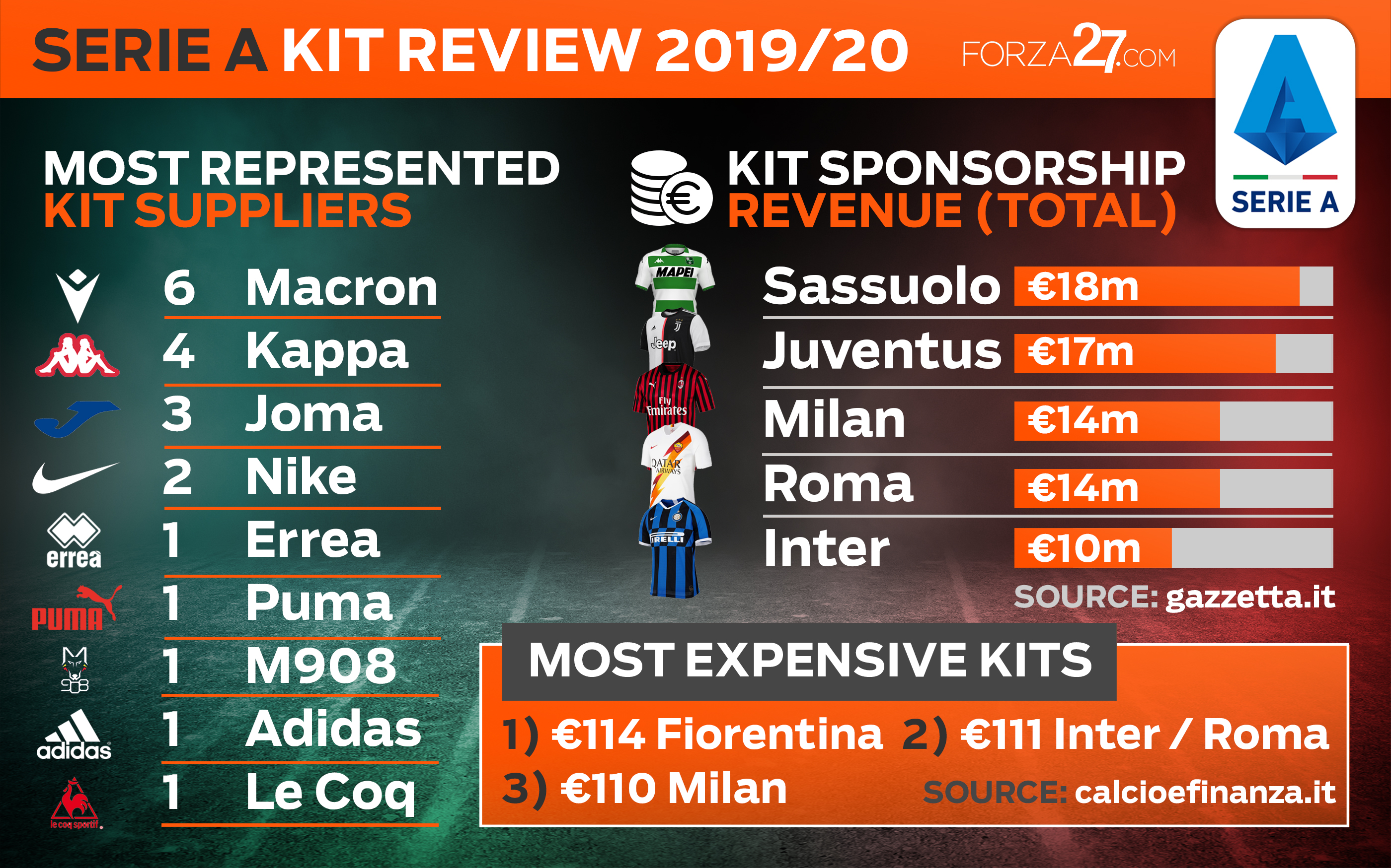
Like last season, I can’t help but feel let down by the similar efforts produced by Le Coq Sportif (see more here). Fashionable garments no doubt (not to mention the most expensive in Serie A), they just have the feel of polo tops, and are just lacking something different on each of the 5 kits, year after year.
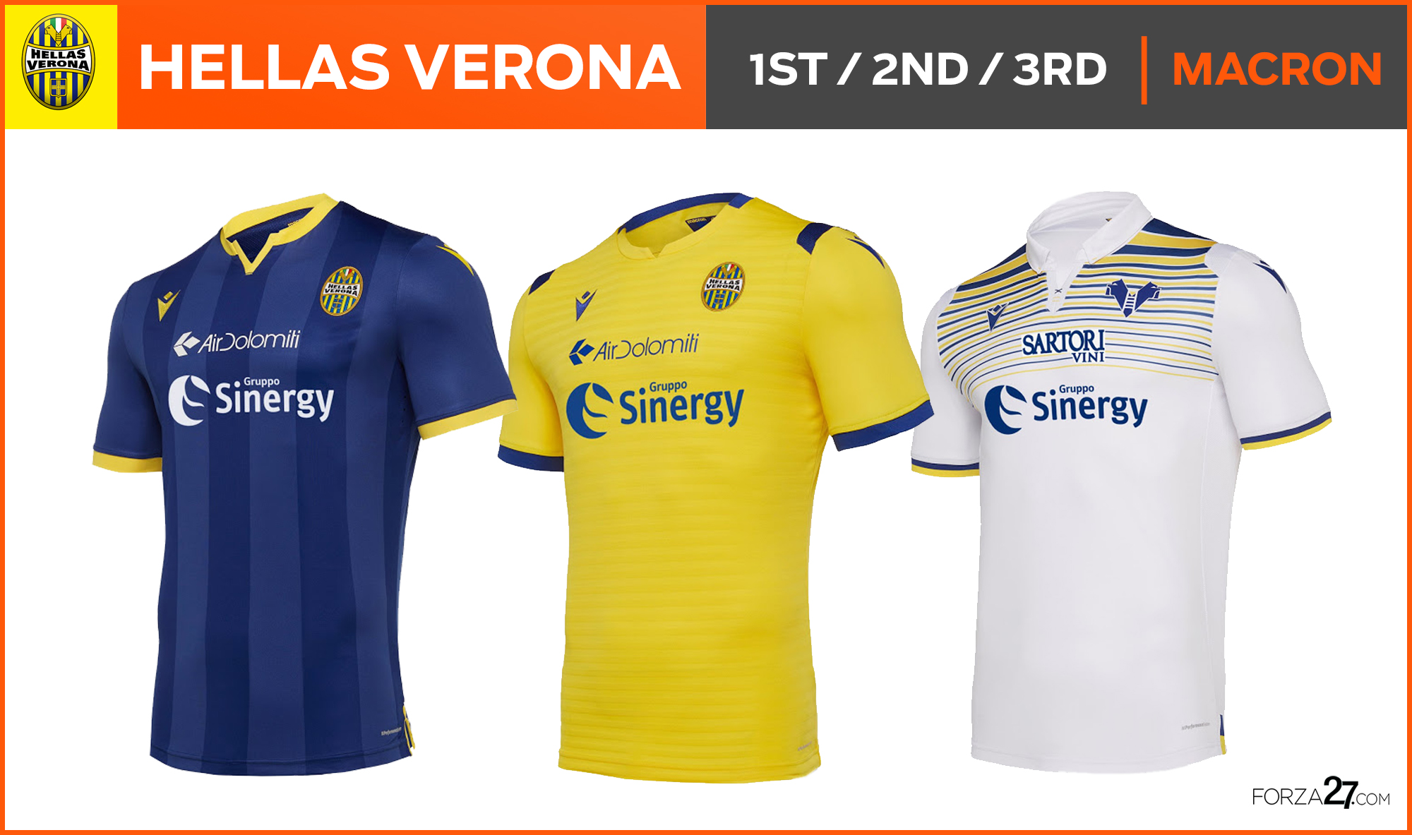
[15] Hellas Verona (new entry)
Verona’s reliable colour combo lends itself nicely to smart and clean kits by Macron. Faded vertical stripes appear on the home, and things get interesting on the yellow away, and particularly the white 3rd which has a nice stripe effect at the top.
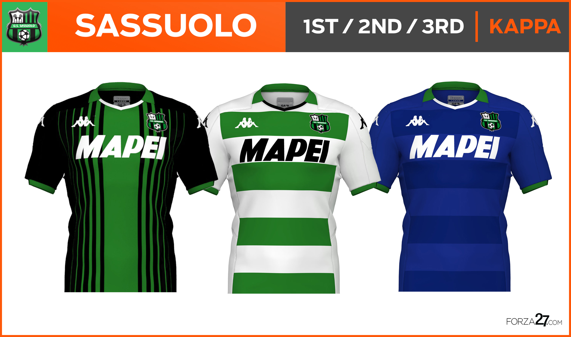
[14] Sassuolo (down 1)
Spaced vertical lines replace the traditional stripes on Sassuolo’s home, a familiar if unsightly black and green combo. The hooped away is a beautiful white with green which is Kappa at its best. Not so much the 3rd.
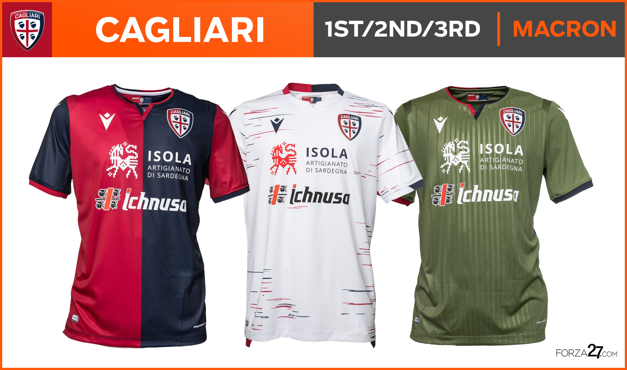
[13] Cagliari (up 3)
Sponsors usually ruin kits (see: Udinese), but with Cagliari I always thought they make them better, giving them a unique, local identity (I also love Ichnusa). An intriguing away kit effort from Macron which has a nice pattern design, but a horrible colour choice on the 3rd brings them down.
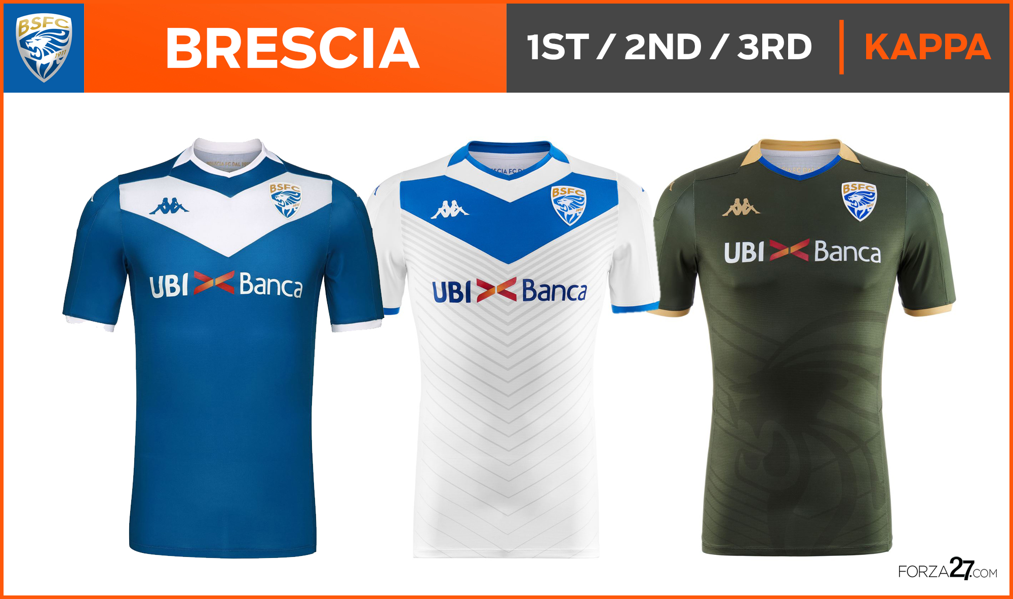
[12] Brescia (new entry)
One of the best things about watching Serie A this season will be seeing @BresciaOfficial‘s iconic white ‘V’, even if slightly squashed up at the top. The white reverse includes an interesting ‘V’ pattern all the way down. Simple yet classy.
[11] Milan (up 3)
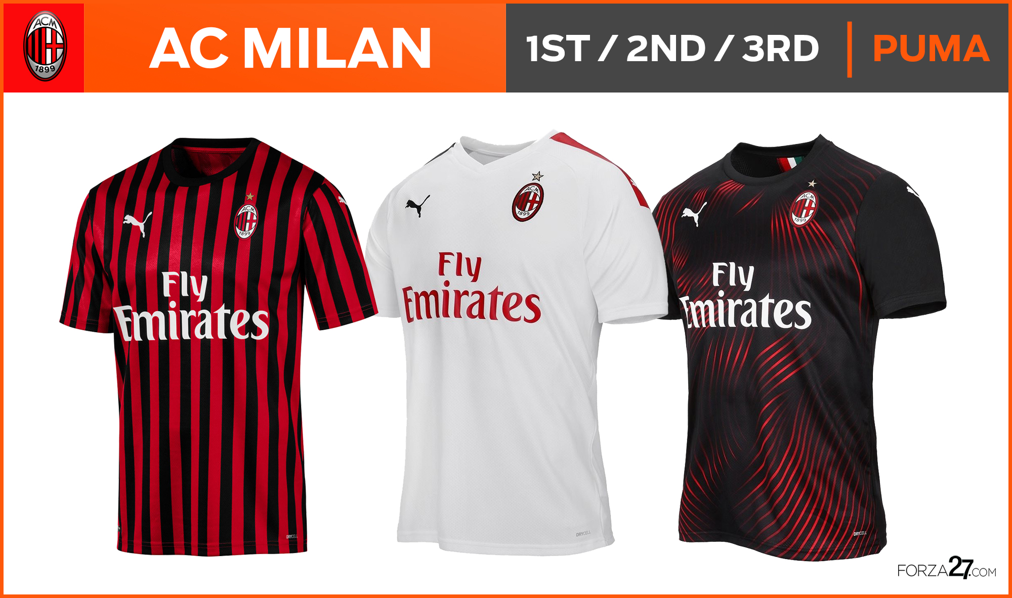
Milan’s second year with Puma and after playing it safe last season there’s a bit more to this years efforts. The big change is the return to the historically thinner vertical stripes on the home kit which give a classier look (see in more detail here). A plain white away, the 3rd is a striking red pattern on black design.
[10] Lazio (down 1)
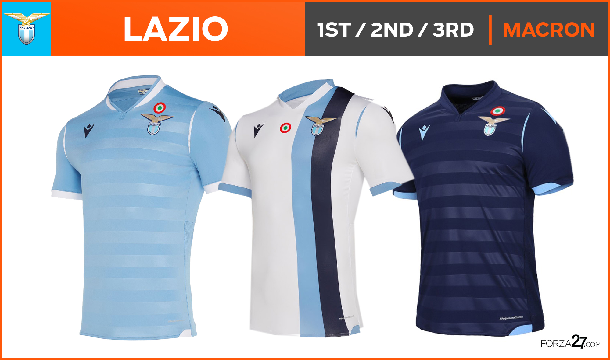
The horizontal stripes on Lazio’s home look slightly lost and confusing with a two-toned blue palette, but the vertical striped white away make up for it with a timeless look. The dark reverse 3rd also tops the home, but oddly no eagle in the design.
[9] Udinese (down 2)
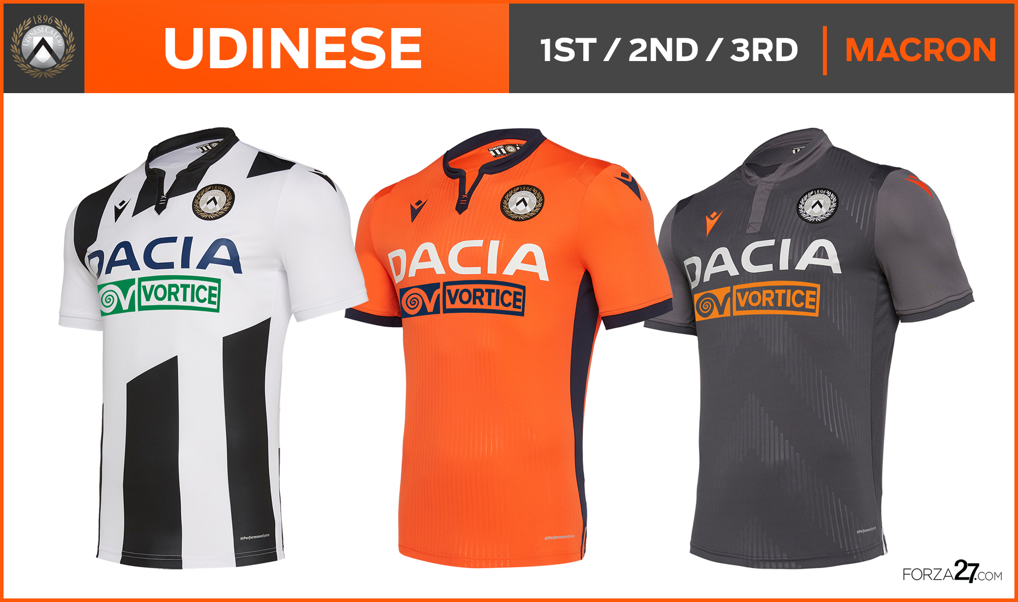
A frankly ridiculous amount of white space to accommodate the sponsors logo ruins a forgetful home, but the colour combos in the away & 3rd are stunning (see more here). The vibrant orange with black & a multi-toned grey are just delicious.
[8] Juventus (up 3)
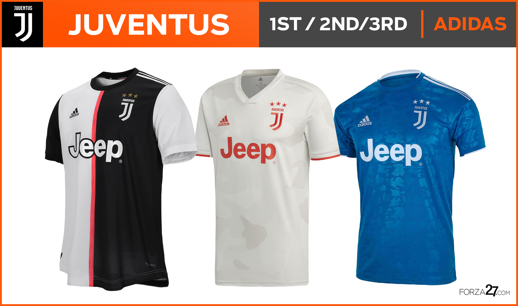
The most controversial kit of the summer bar none. But when (if) you look past the tradition, it’s rather clever and smart. Juve are becoming worldwide frontrunners with their marketing game which has seen them change their logo and branding in recent years, but its too soon for some fans. Let down (or saved) by bland-patterned away and 3rd.
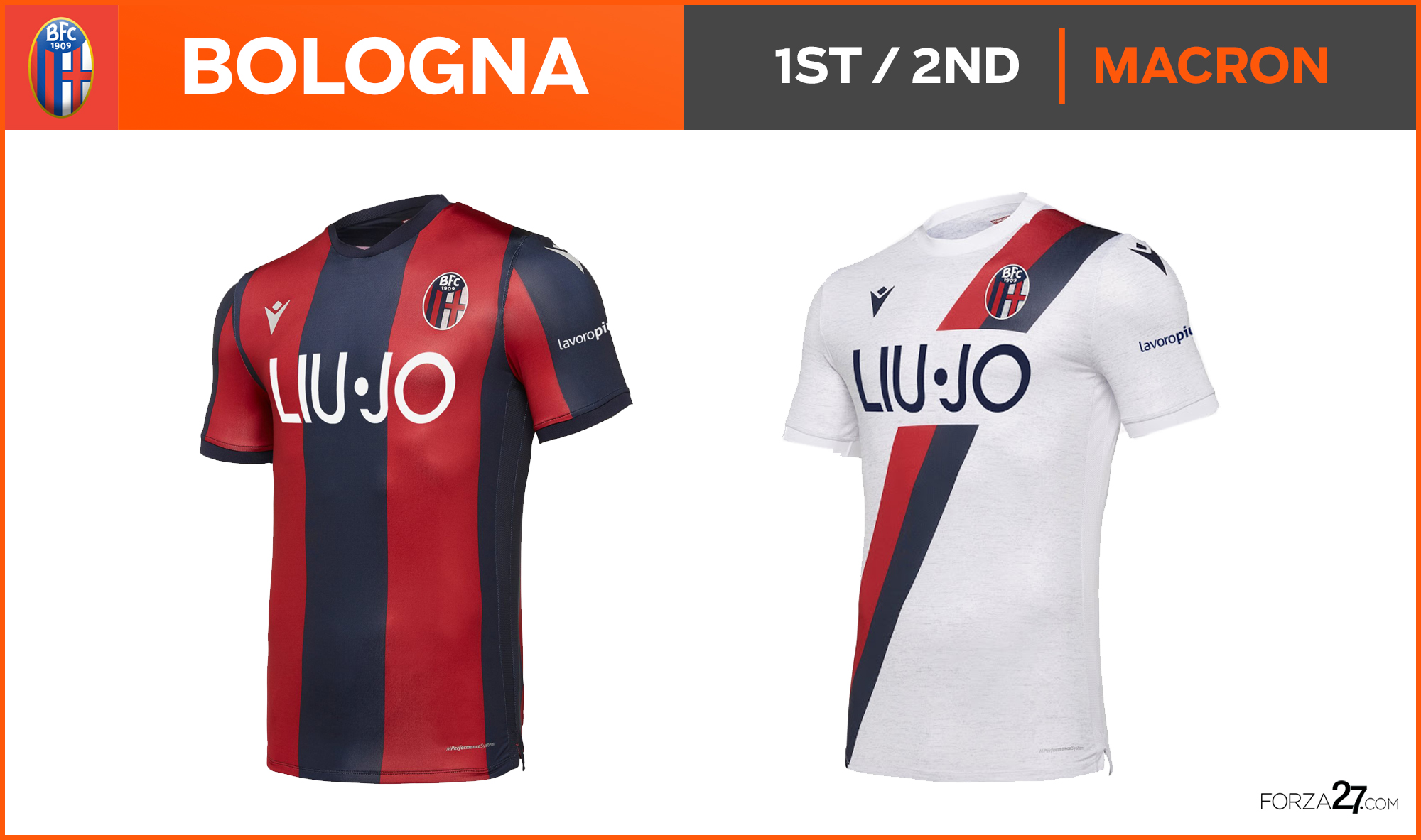
[7] Bologna (up 11)
Smart, stylish & sophisticated, @MacronSports‘s home and away for Bologna are big improvements on last seasons. The striking white away has a stylish diagonal band, although needlessly interrupted for the sponsor.
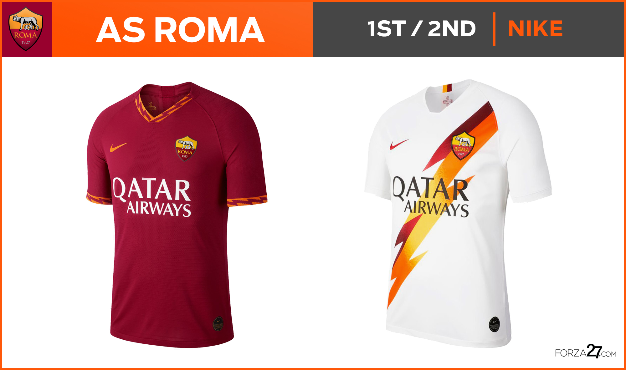
[6] AS Roma (down 1)
Nike have really stepped it up in recent years for Serie A clubs and Roma’s ‘lightning-bolt’ theme makes a striking impression (see more here: AS Roma kit overview). The white away had that classic feel but ultimately fell from the sky with a poorly executed colour-gradient bolt. A rumoured dark blue 3rd is a potential classic which would drive it up the rankings here.
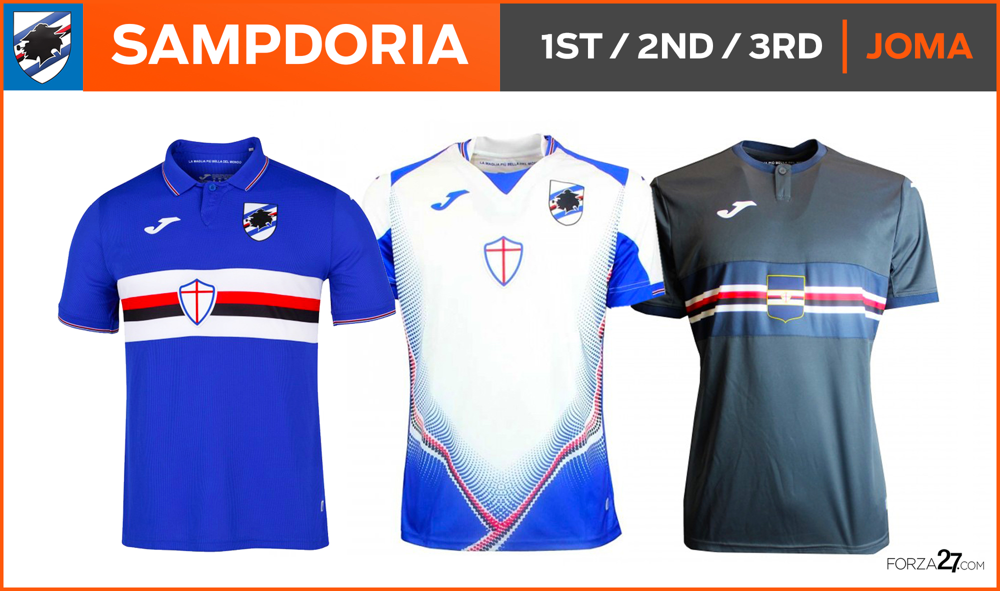
[5] Sampdoria (down 3)
The home remains as classic as ever, now with a traditional collar and a return of the traditional crest (the centre one is also kept), but it’s a big slip down the rankings for a shocker of an away kit. A very smart navy/grey 3rd does its best to make up for it.
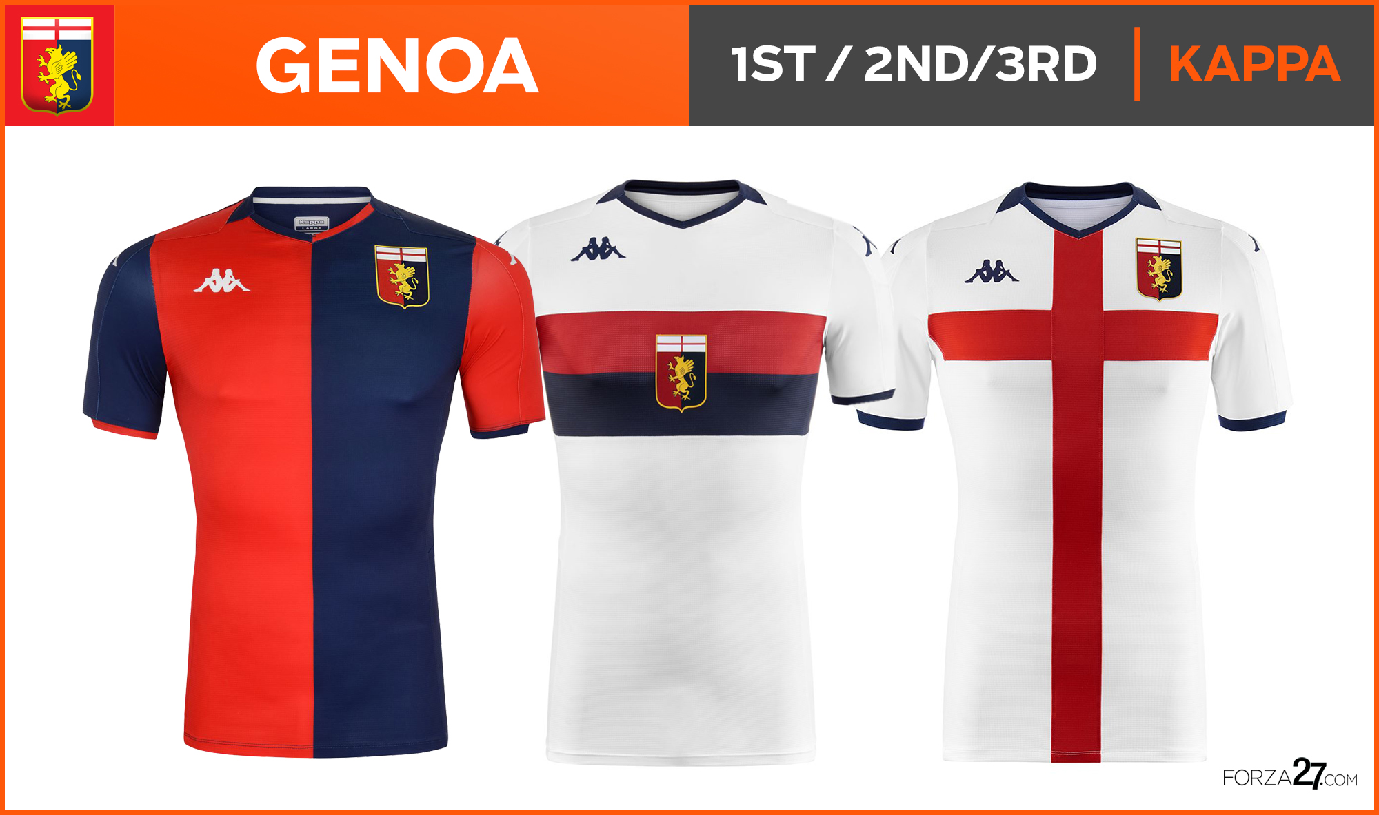
[4] Genoa (up 10)
A first year back with @Kappa_UK and one they get spot on with that classic home half & half shirt. Another simple yet stylish away was followed by a completely unnecessary and similar 3rd – which turned out to be the nicest of the lot, and possibly of the summer.
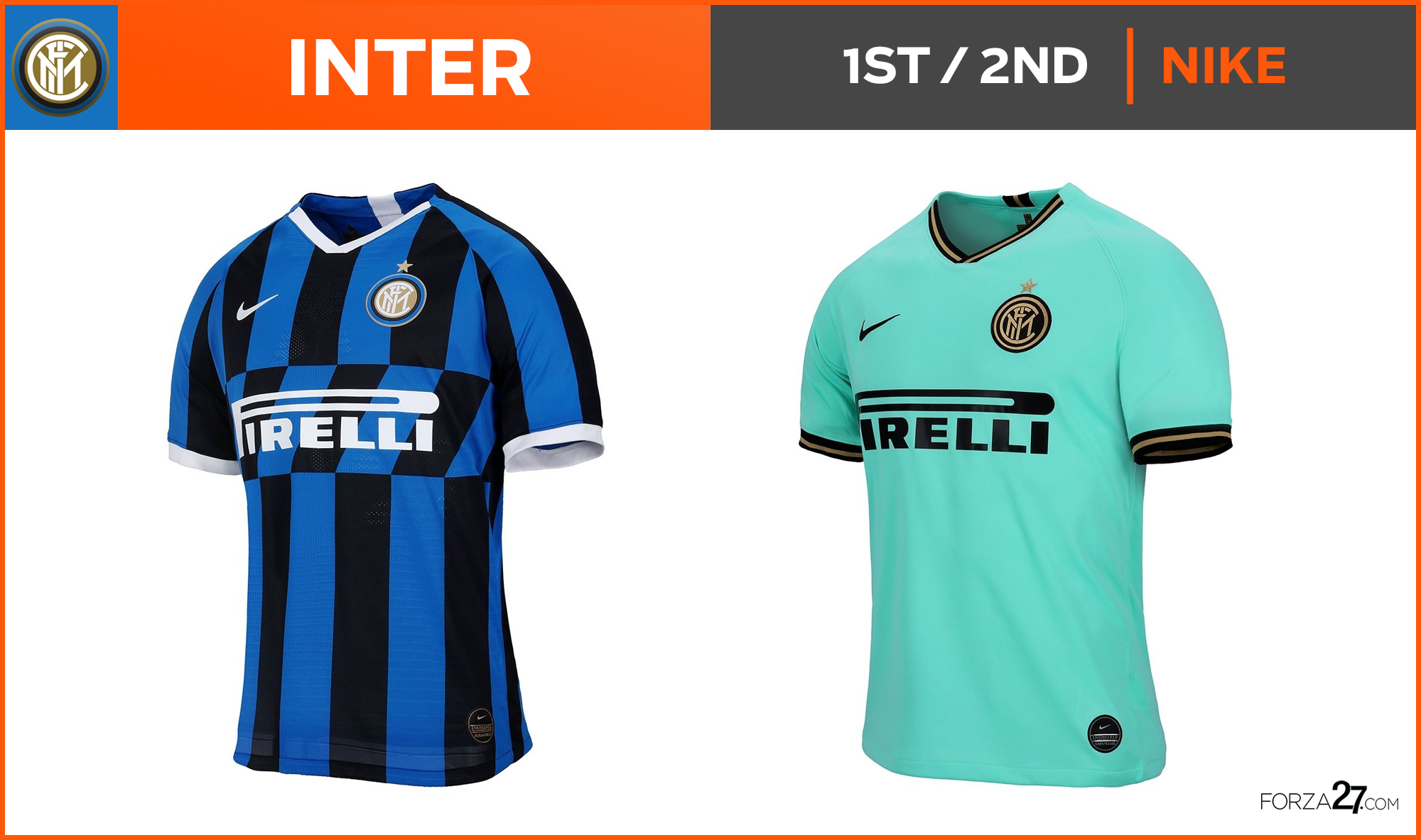
[3] Inter (up 1)
The slanted stripes on the home may look a tad disruptive at first glance but it lends to a classy overall style influenced by that iconic 1989 ‘Misura’-sponsored shirt (see more here). However, the away is the star of the show with a strong teal with black trimmings. Instant classic.
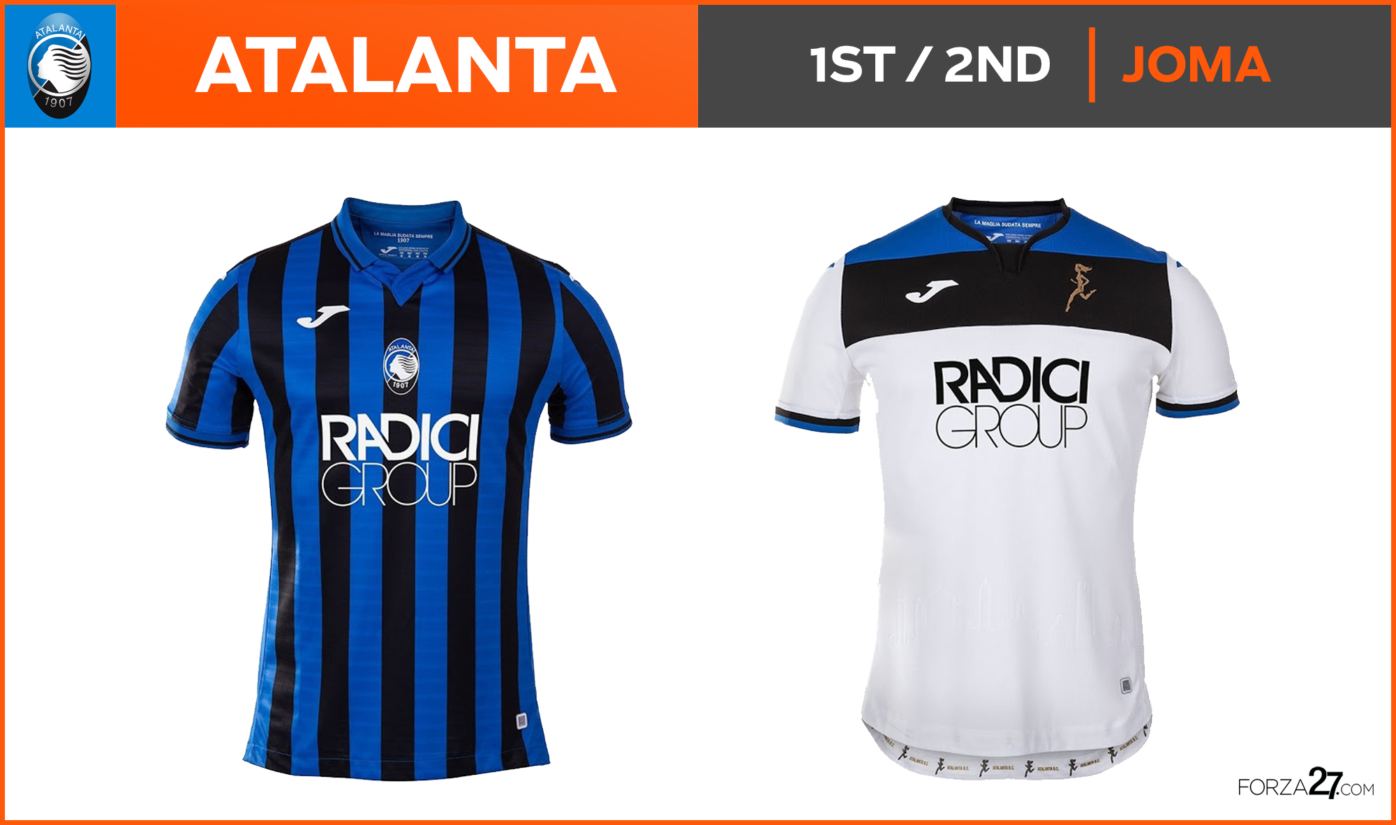
[2] Atalanta (up 1)
Close to the top spot, Atalanta continue their rise and go from strength to strength and move up to second in our rankings. Last seasons classics have been perfected by @JomaSport to a faultless home and a stylish white away (just a pity to lose the special La Dea crest). Their much anticipated 3rd will also impress.
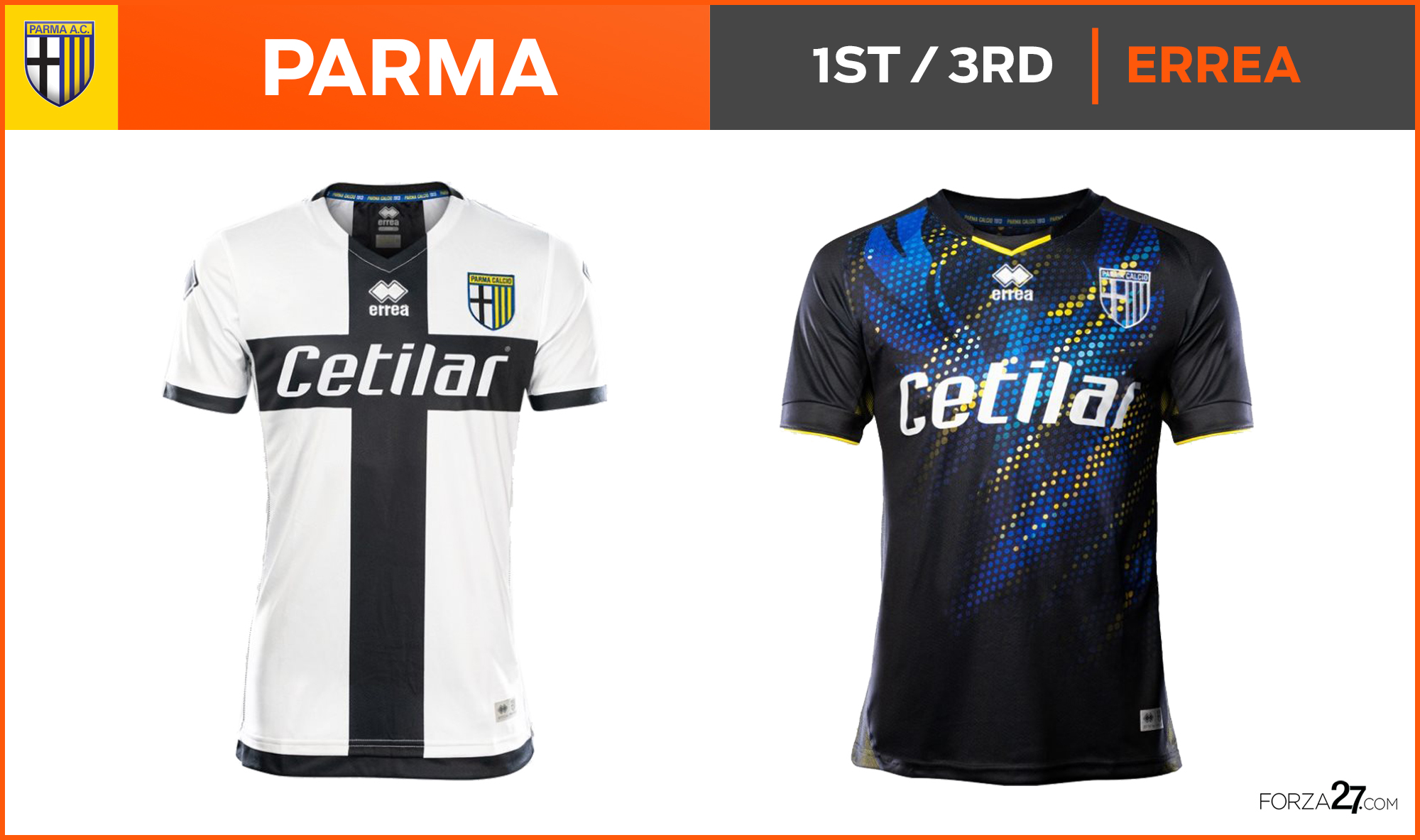
[1] Parma (no change)
After last years mind-blowing kits from @ErreaOfficial, Parma retain top spot with a similar home kit minus the collar, which gives it a more modern feel. With the classic yellow and blue away still to come, the black 3rd – dubbed the Black Phoenix 2.0 – is a sensational design to rival last years stunner (see more on it here). No one is making kits like Errea at the moment, and they rightly retain their crown.
So that’s it for another year, Parma and Errea Sport reign supreme once again for the second year running. It was a close run thing though with both Atalanta and Inter challenging them hard for that top spot.
Below you can see a review of all the kit manufacturers, which has homegrown Italian brands Macron and Kappa leading the way, with a surprisingly low number for giant like Nike, Adidas and Puma. Its also a surprise that Errea are only represented once (albeit in top spot) considering the quality of the design in their kits in recent years.
Also below is the total for the kits sponsorship revenue (with a surprising leader) and the most expensive kits to buy in Serie A this season. Not that that will stop you, being the kit lovers that we all are. The exciting new season has just begun, and its begun in style.
