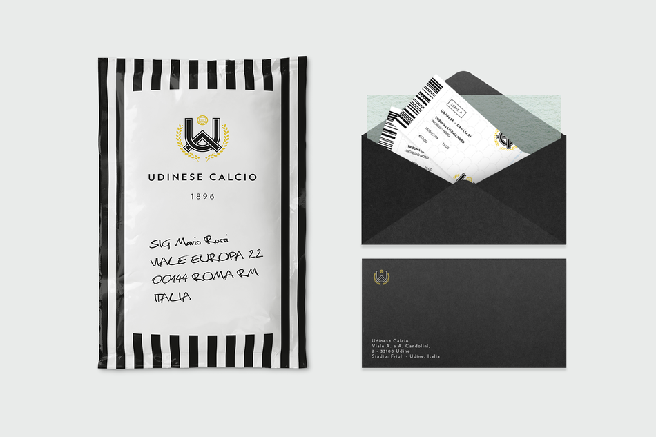
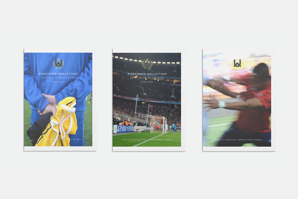
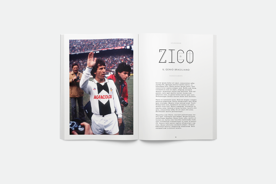
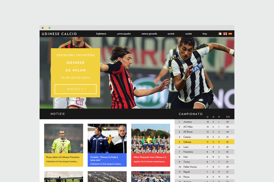
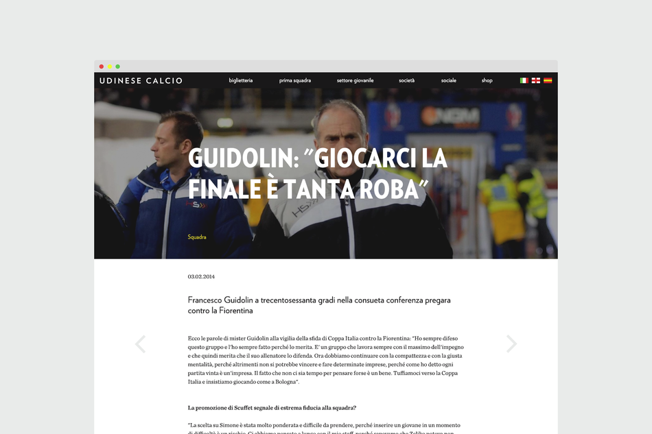
Fascinating rebranding effort of Udinese Calcio, by Francisco Seiz Freitas, a digital designer based in London, originally from Portugal.
In Francisco’s own words:
Loads of fun because I have no connection to the club nor am I even Italian which meant that I had learn about the culture in Udine, investigate and research more – which, to me, is part of the fun!
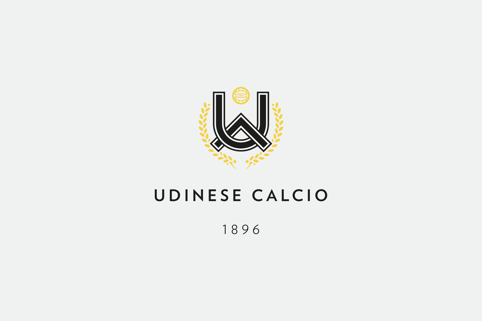
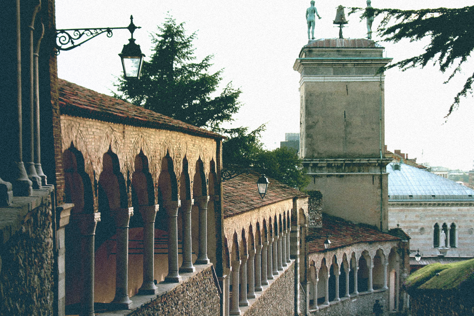
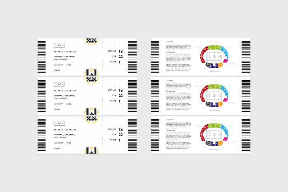
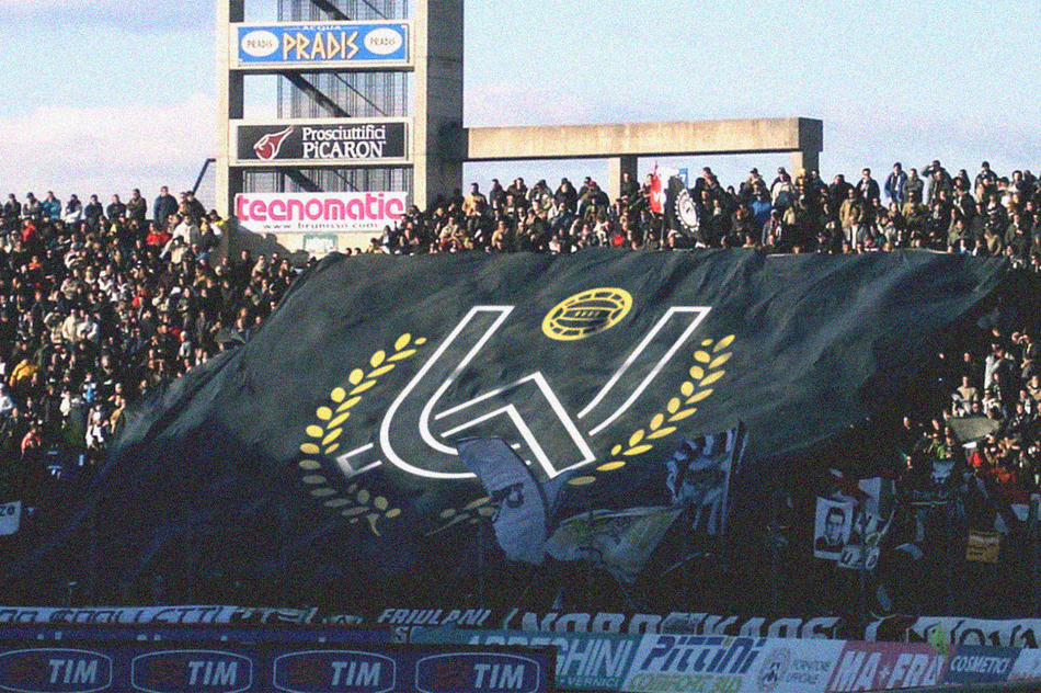
In the final design, the arch is from Udine’s coat of arms, which is currently what their basis of all their past crests have been. After going on a lot of forums and tourist boards to find out the locals and fans attitude towards it, I found that they were really passionate about their heritage. So I tried to incorporate the arch by inter-linking it through the U for Udine whilst keeping a subtle ‘shield-like’ shape.
Udine was historically an important Roman city so I decided to keep the Laurel Wreath that was on the previous crest, just simplifying the details a bit and streamlining it. I think it added a bit of character to the identity.
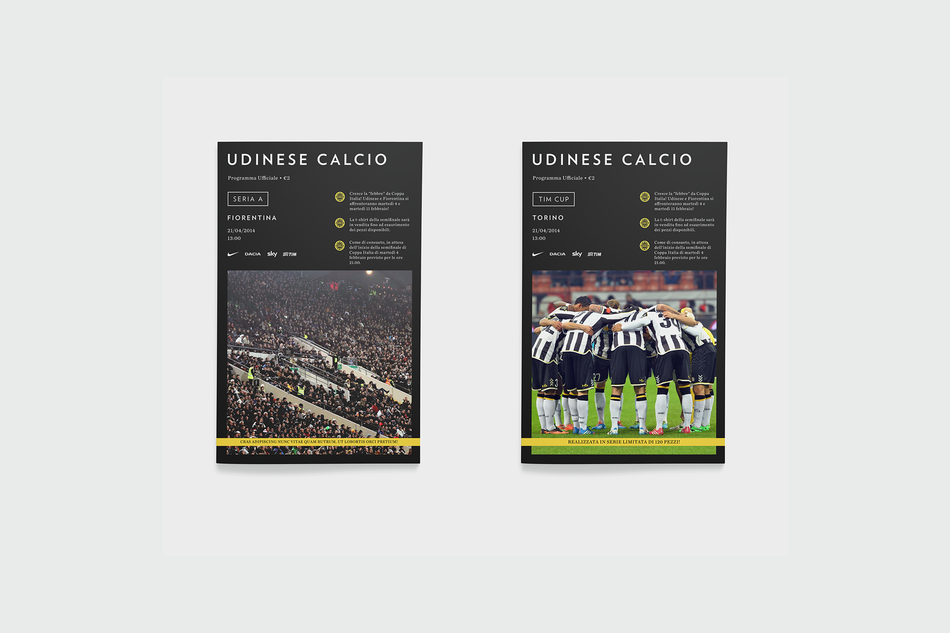
Wanted to achieve a much cleaner look with a clear nod to Udinese’s history. Keeping it sophisticated but hopefully not snobby.
Click on each image to see bigger


